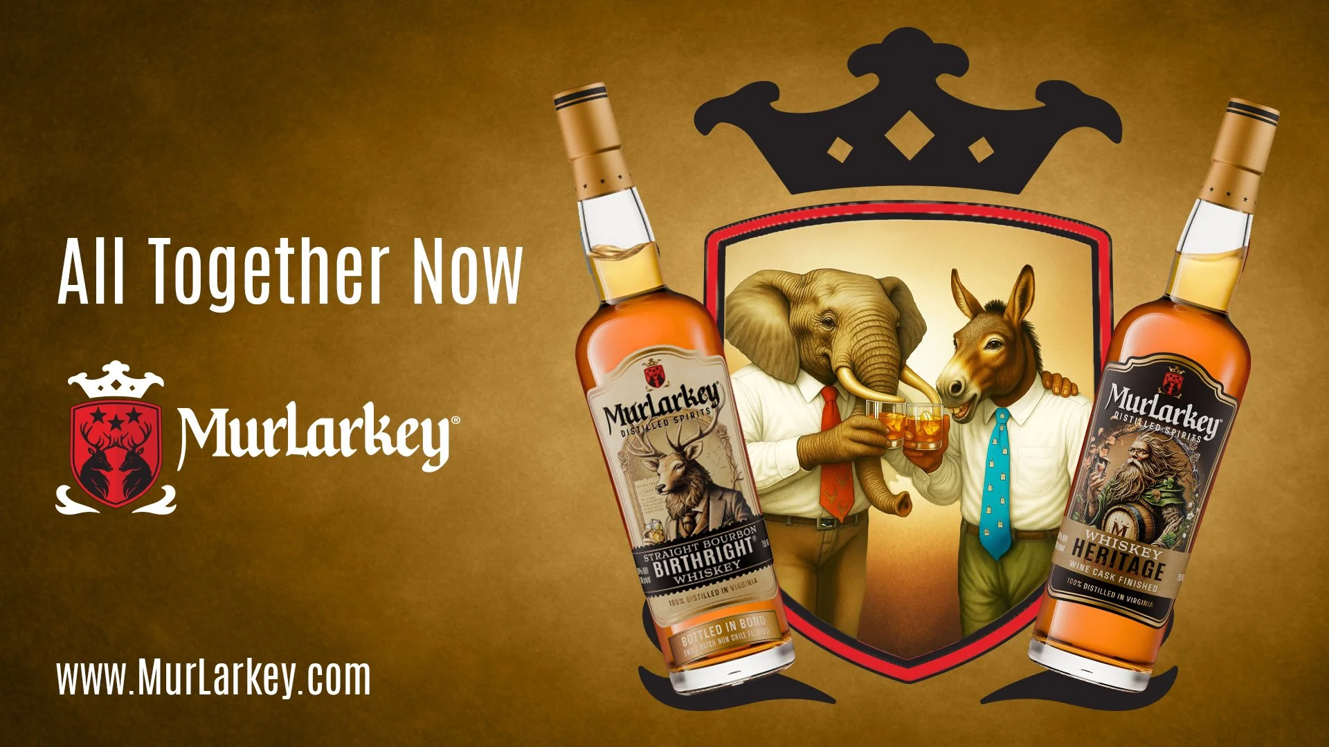
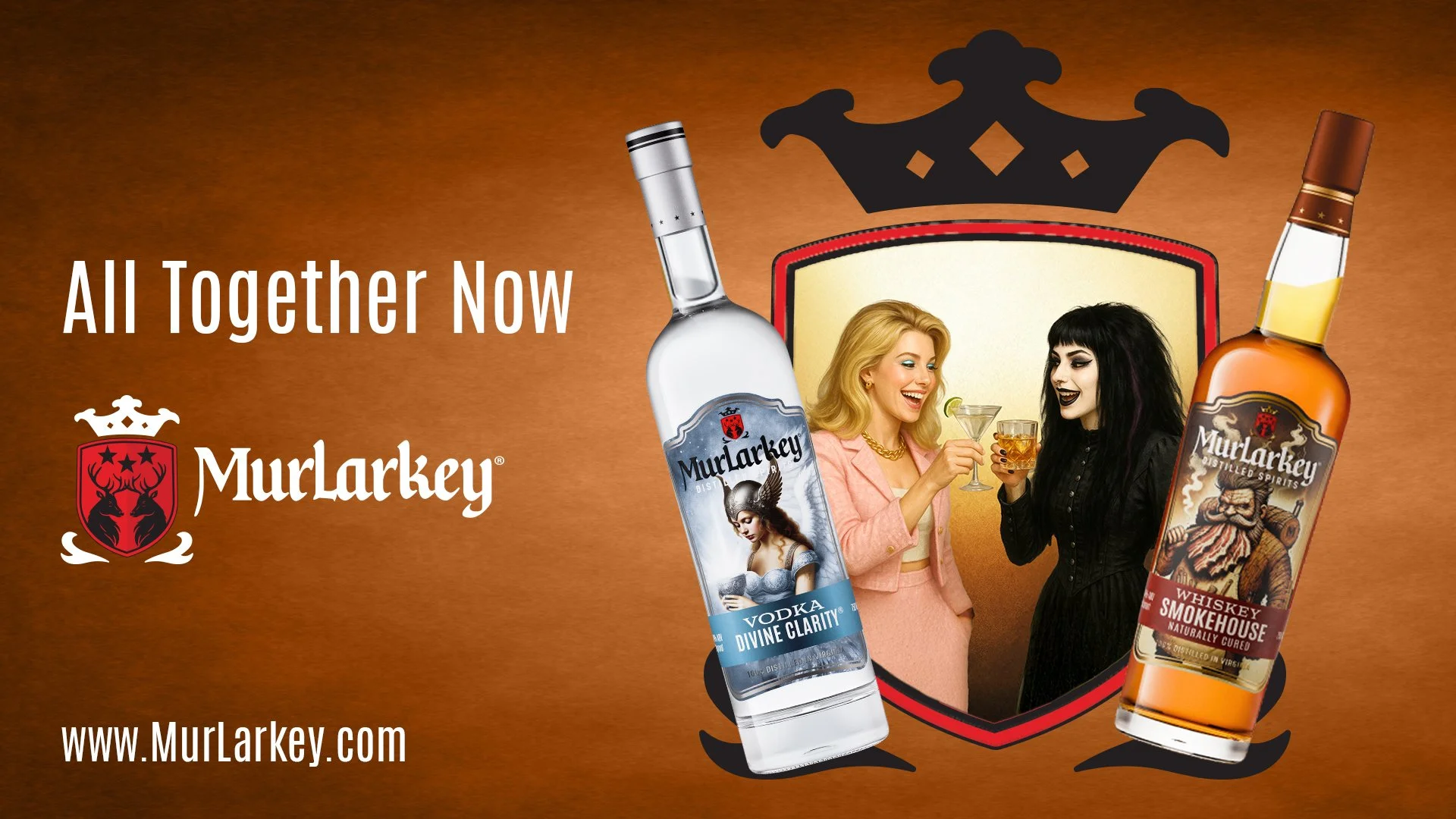
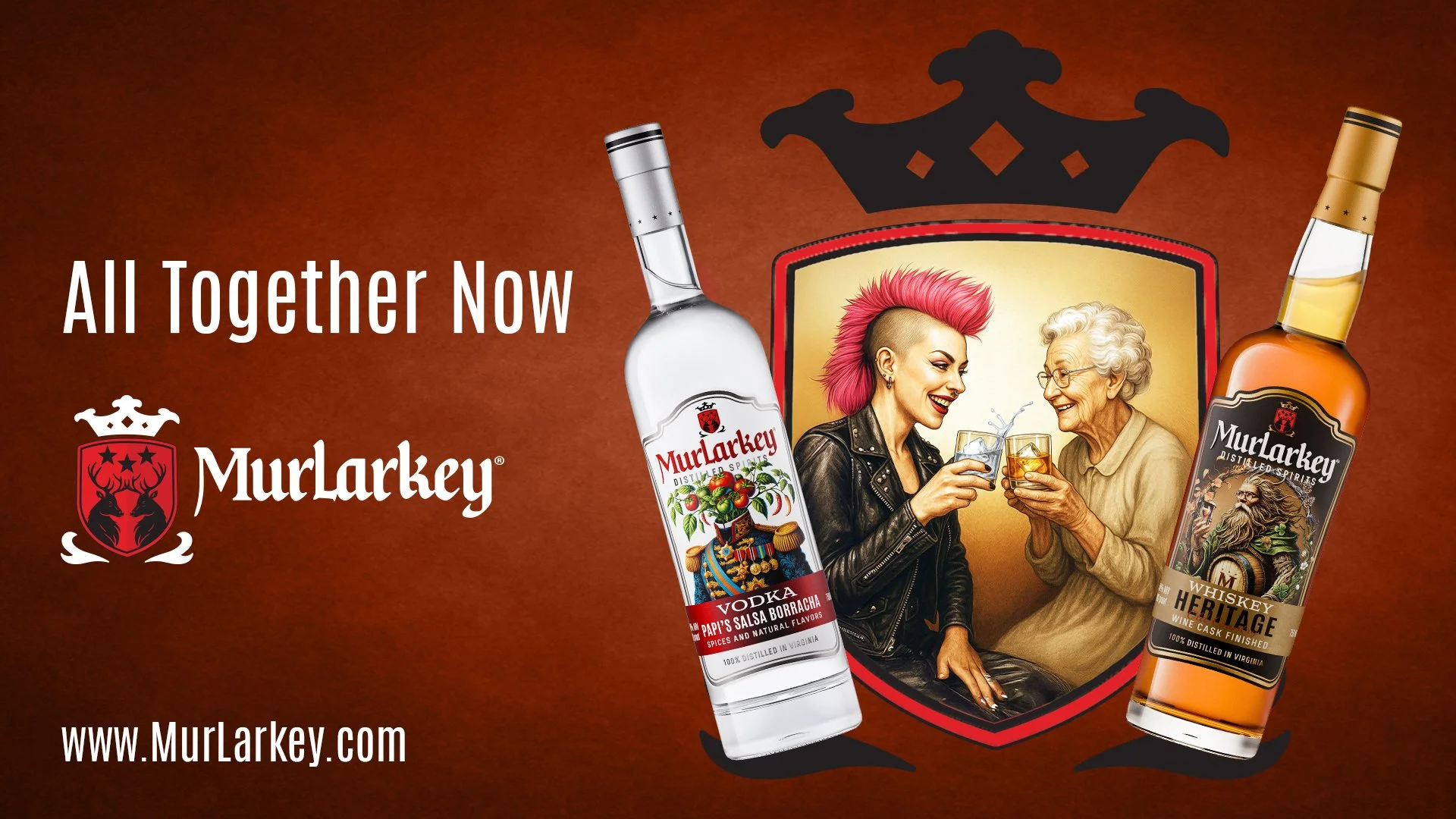


Murlarkey Distilled Spirits | Marketing Campaign
MurLarkey has grown tremendously. Where once they existed in a distillery off a main road with a tidy bar and on-site merch store, they’ve moved onto a campus that features a brewery, inside/outside performance venue, event space, hotel, their distillery, and their restaurant.
Good things come to good people.
They asked us to launch their first large-scale advertising campaign. We couldn’t have been more excited.
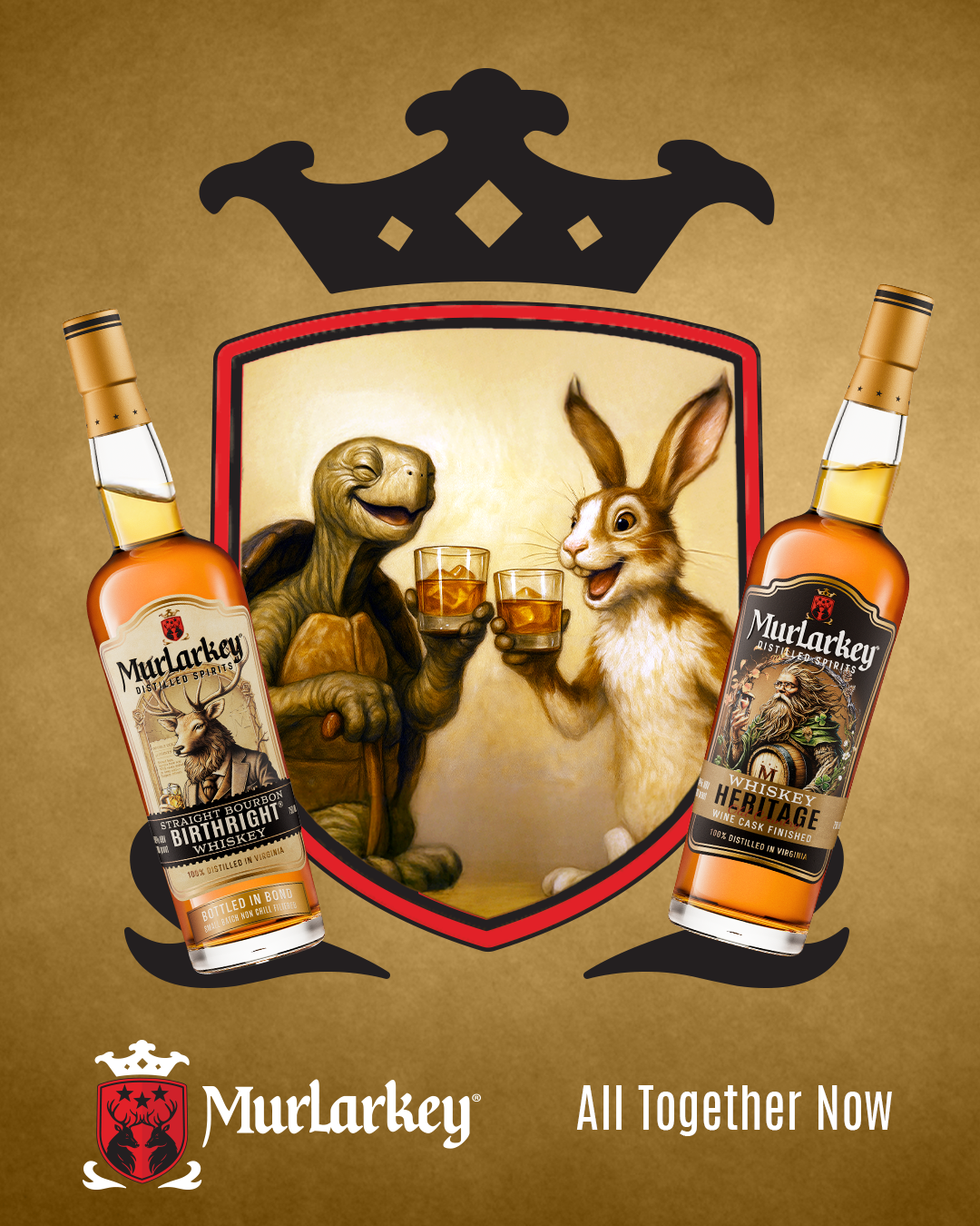
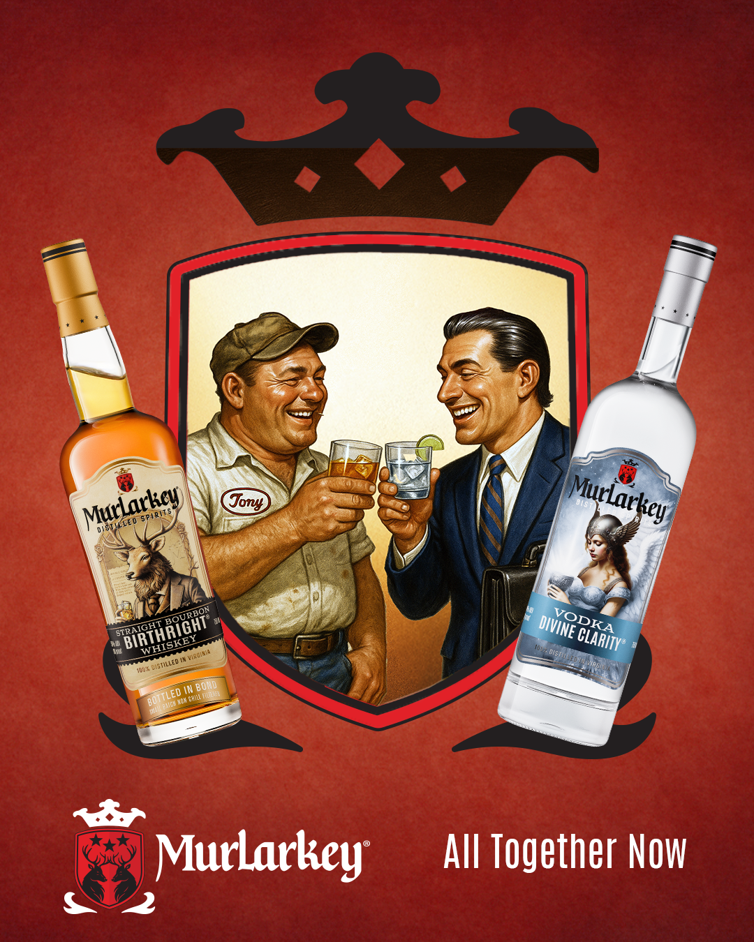
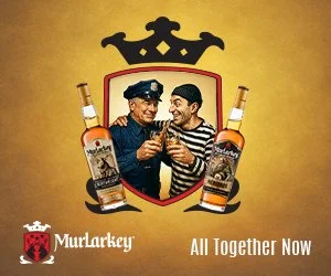
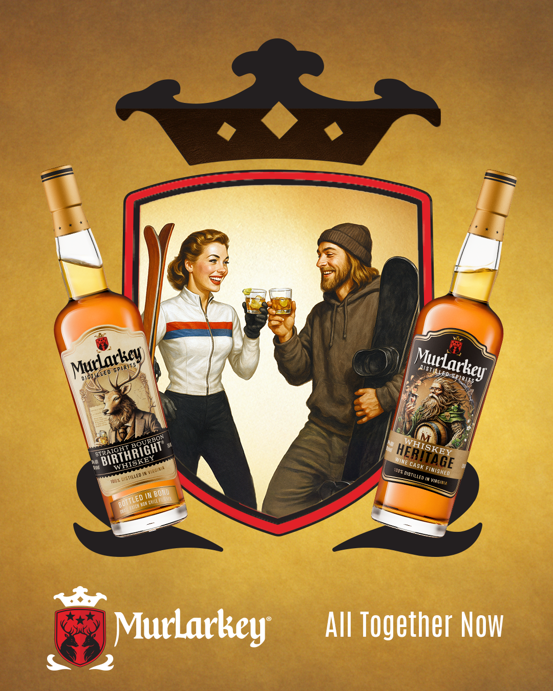
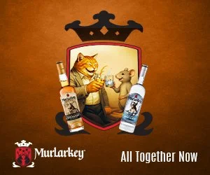
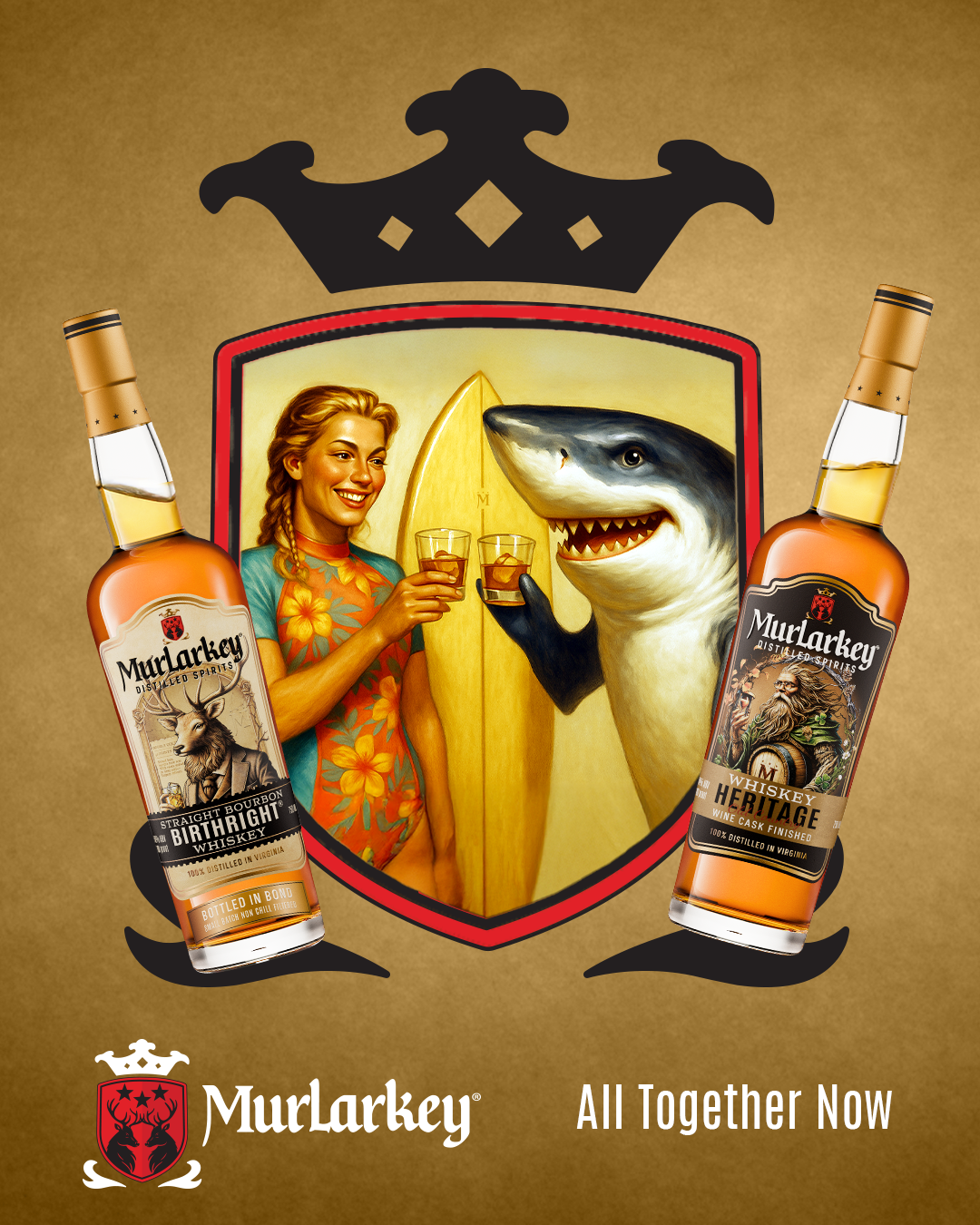
We knew the campaign had to be joyful, because their recent brand update included the promise: MurLarkey crafts joy. And we knew we’d have to appeal to a wide audience, because MurLarkey isn’t a single liquor distillery. They do gin, vodka, whiskey, bourbon, infused spirits, and more.
So we created a campaign in digital-out-of-home, online banners, and social media featuring opposites enjoying different MurLarkey products. You can imagine how much fun it was to dream up these rival combinations. The characters sit above a tagline that reads: All Together Now, because that’s what MurLarkey offers by way of liquors and to those who come to share in the joy of one of their cocktails.


WorldPride 2025 | Event Marketing
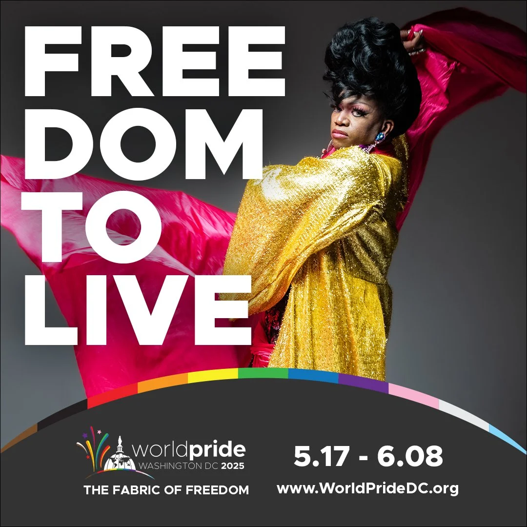
Washington, DC was selected to host the largest LGBTQ+ event, WorldPride 2025. It’s a massive, international gathering that involves coordination across event management, hospitality, local government, international organizations, public relations, media, and more. And Joy Riot was the advertising agency in the center of it.
We convened cross-sectional meetings with leadership and partner organizations to understand the various interests and to assign roles. Then we developed a campaign concept that would unite them all, focused on the event’s theme: The Fabric of Freedom. This concept aligns the most fundamental American founding value, freedom, with the people of the worldwide movement, who are its fabric. It features large type over a consistent headline formula celebrating all the freedoms the movement has fought for and will continue to advocate. We hired aerial acrobats to advise on positioning talent holding a eye-popping silk to symbolize the fabric. And we sourced the talent from the local LGBTQ+ community.
Simultaneously, we negotiated with media outlets around the world to plan a highly-targeted media buy based on key demographic, behavioral, geolocation, and other parameters to follow our target audiences around in their daily lives.
The marketing campaign is currently running in over 20 countries in all media—video, radio, digital, social, CTV, print, podcast, website, email, OOH, DOOH and more—with additional PR initiatives worldwide to drive the millions of attendees.
Westchester County, NY | Brand Identity
Westchester County, NY is one of the most recognizable county names in the country. Its brand has been built by its proximity to New York City and its appearances throughout pop culture and the media.
Yet the county’s logo was stale. It has been unchanged since our main client contact was in high school. And it just didn’t contain the wow factor the county deserves.
We conducted qualitative and quantitative research to better understand the county and its people. It’s a dynamic place, constantly in motion, bordered by two rivers, recognizable for its leafy suburbs, and whose people radiate a sophisticated charm. Our strategy statement based on research was: Westchester County Connects.
All those takeaways combined into our logo.
The connection is symbolized by the hook that connects the C and H. Westchester's people are linked by rail, road, and air. By culture. Most importantly, by choice. Using Colombia Blue to capture the county’s prestigious history, Dark Green to reflect the tranquil natural environments, and Indigo Dye to mimic the splendor of the waterways, we’re left with a combination that’s bold yet balanced—just like Westchester.


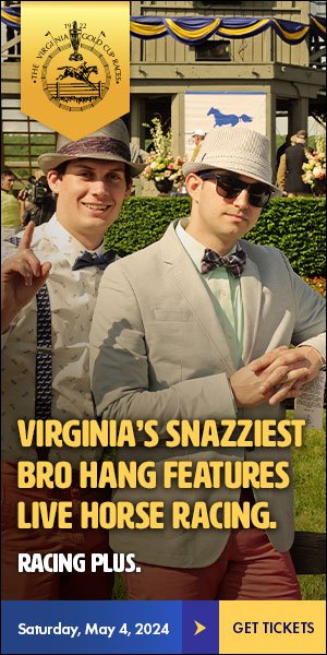

Virginia Gold Cup | marketing Campaign
On the first Saturday in May, for over 100 years, the Virginia Gold Cup steeplechase race has been held in Warrenton, Virginia. It regularly attracts crowds of 60,000 for a full day of fascinators, libations, cigars, and horse racing.
In fact, the crowds became so large—and rowdy— that the promoters started winding down their event marketing to stem complaints from long-time regulars that the day was getting out of control.
But couple that with COVID, and the attendance reached shocking low levels. We were hired to bring the fun and the crowds back to the race. Our audience was two types: a) people who like to have fun, and b) people who don’t already attend horse races.
We ran a social and digital media campaign in numerous ads along the same format. We showed imagery of crowds dressing up and getting down throughout the day itself, and mentioned in the headline that in addition to all this fun, there also happens to be a horse race. The campaign attracted higher attendance than any previous years, and even won an American Advertising Federation Award.


Naperville Public Library | Brand Identity
The Naperville Public Library has been rated the #1 public library system in the United States. Locals love it.
However, as a bedroom community of Chicago, there was a significant population of newcomers who didnʼt appreciate the draw of the library upon arrival. They especially werenʼt impressed by the outmoded and confusing former logo.
So we redid it entirely.
We studied the locations of the three branches. They form almost an exact triangulation of the town layout. And while each is unique, they all boast superior technology, including 3D printers, and other offerings you donʼt expect in your common public library.
The primary type we chose is a contemporary rendering of a classic serif, blending the traditional idea of a library with their modern amenities. The mark is three distinct elements that are the same shape but different, vibrant colors, and each wraps on the end to show a three-tiered back that is reminiscent of both library stacks as well as a computer chip.
As you can see, we developed their brand guidelines, including look, feel, voice—who we are, who we are not—and applied that to their collateral.
The new brand has had an overwhelmingly positive response from employees and the Naperville community.
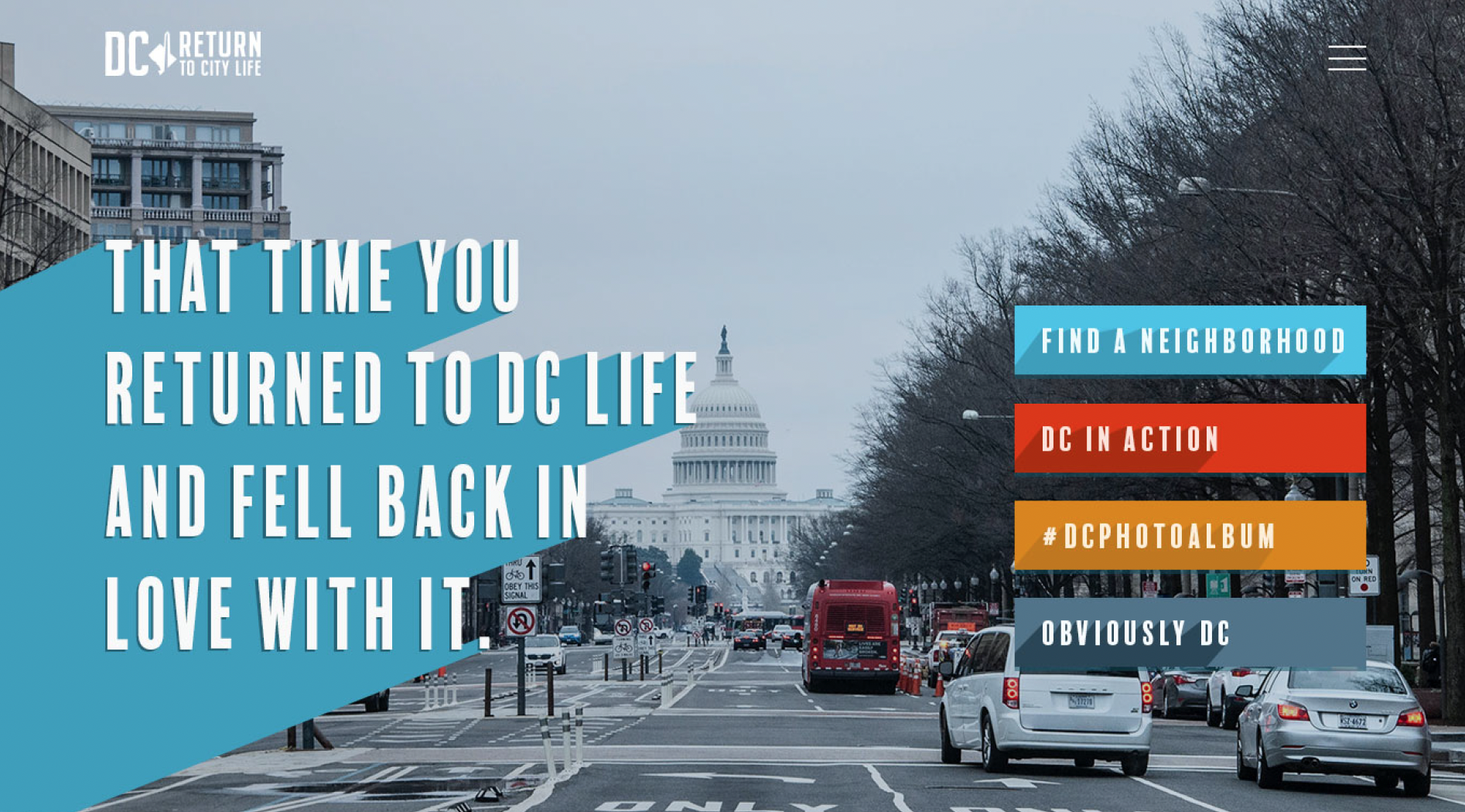
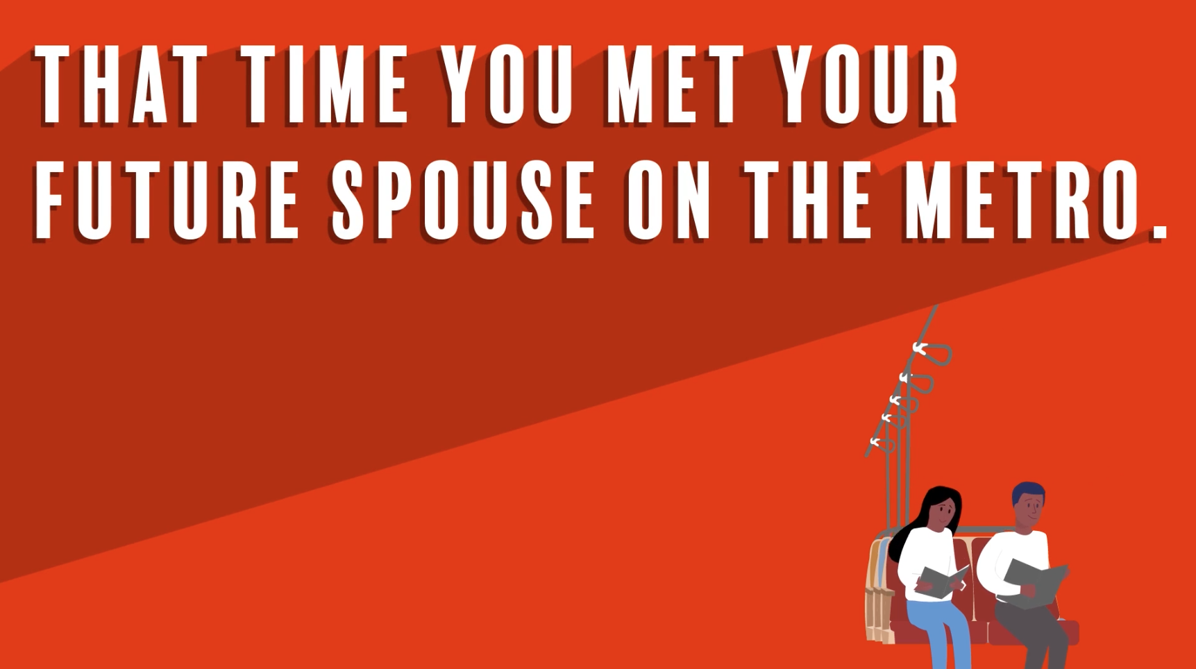
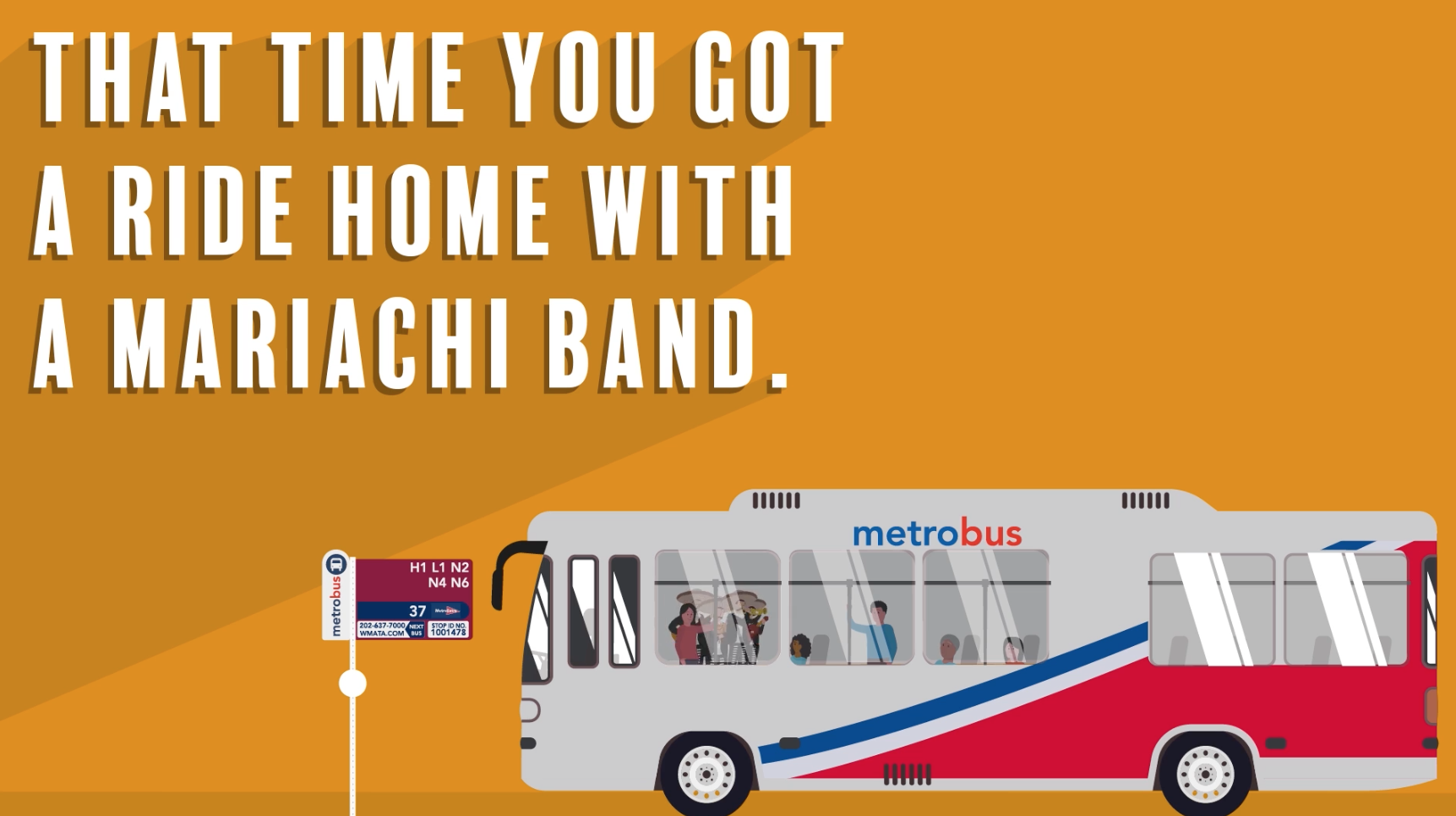
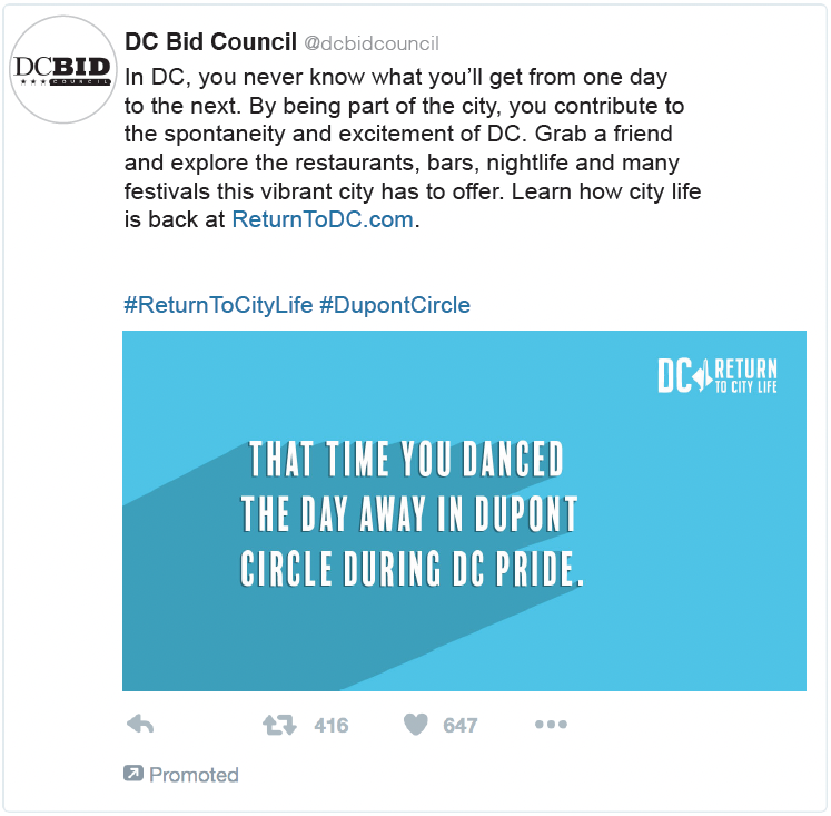
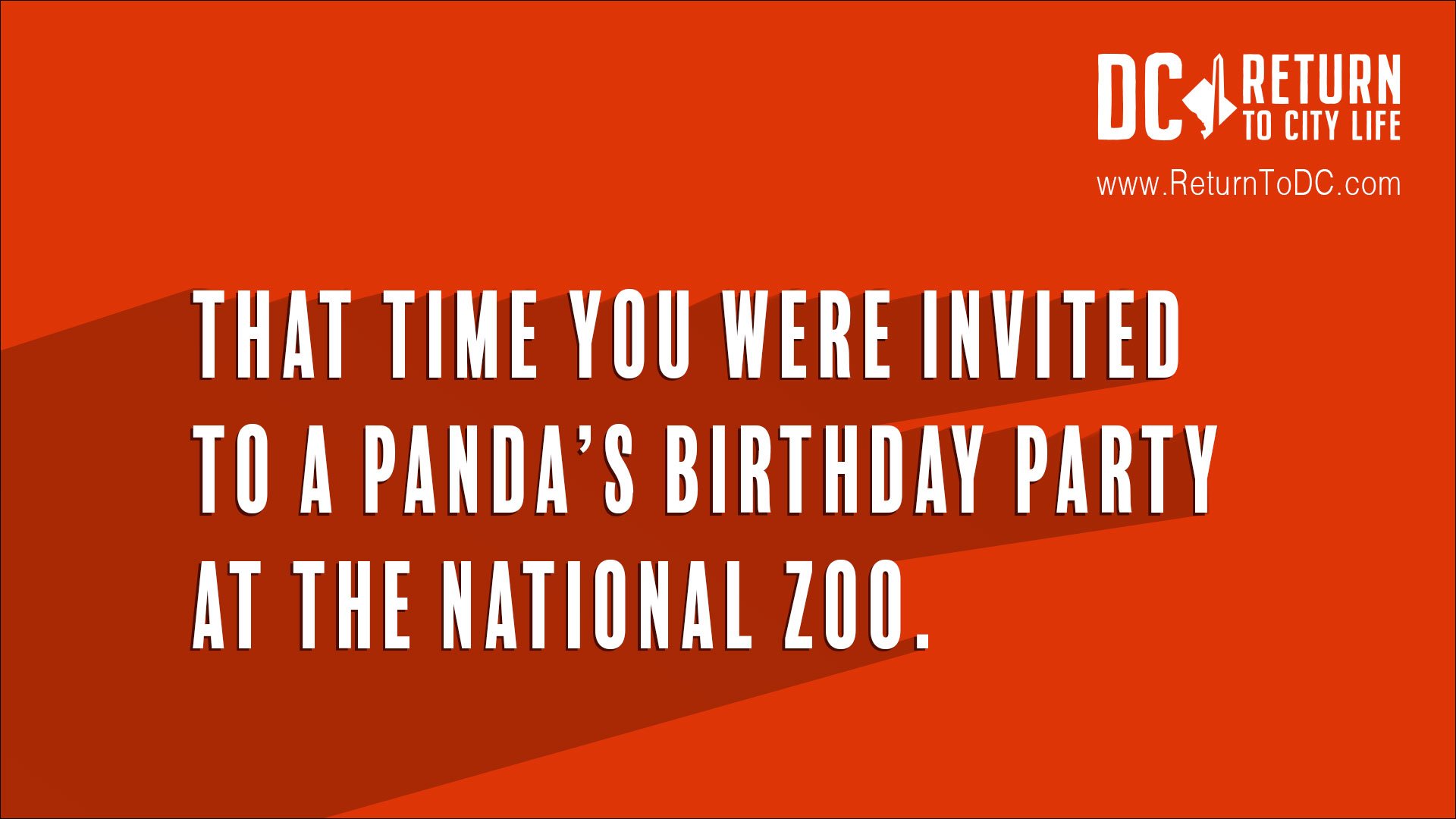
Washington, DC | Marketing Campaign
Covid-19. Didn’t see that one coming. It impacted all of us. It even impacted municipalities.
Washington, DC was not immune. There were times when it had some of the country’s highest rates. Therefore, DC instituted strict safety mandates. Eventually, those mandates compromised area businesses—coffee shops, restaurants, bars, dry cleaners, clothiers, museums, stadiums, and other landmarks were commuters spend their time and money.
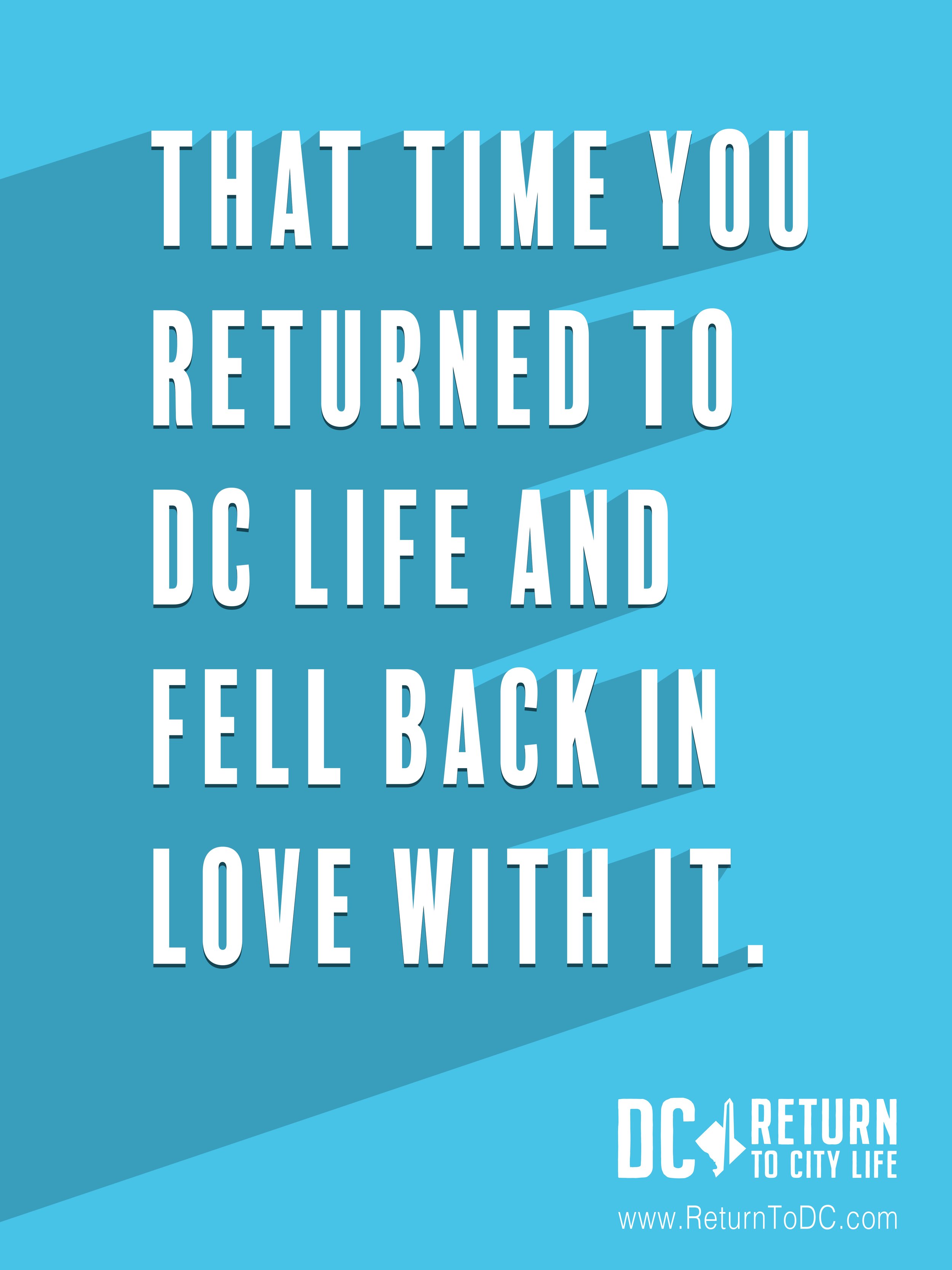
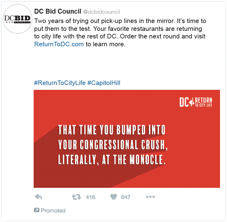
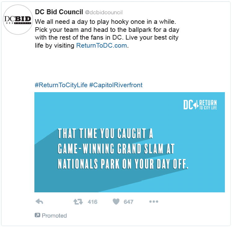
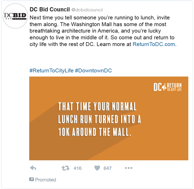
To entice them back once rates subsided, we launched the Return to DC campaign, working with the DC Office of the Deputy Mayor for Planning and Economic Development, the DC BID Council, and all eleven Business Improvement Districts (BIDs). Qualitative and quantitative research told us that people react most strongly to FOMO: Fear of Missing Out. So we reminded them of “That Time…” all the funny, crazy, romantic, and otherwise memorable moments occurred to them in DC.
The campaign launched in digital banners, digital out of home, traditional out of home, social media, and emails, that all pointed back to a microsite where residents took part in challenges that encouraged them to return, post evidence on Instagram, and engage with the community.
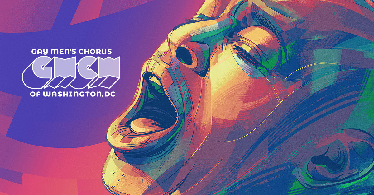
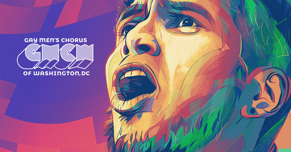
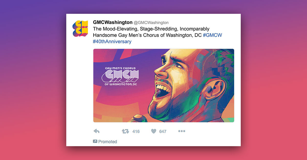
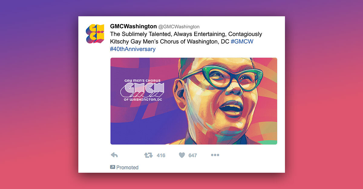
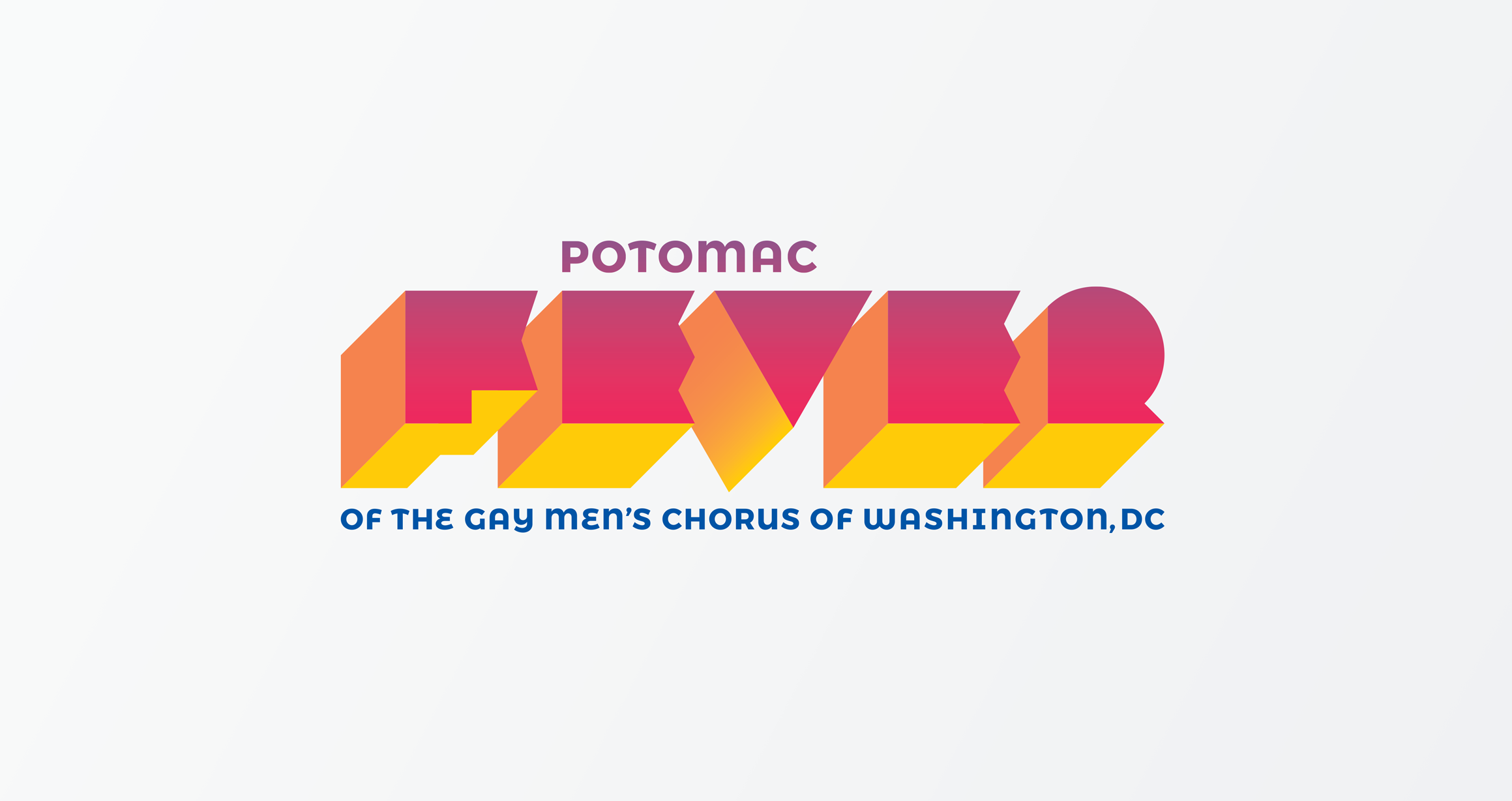
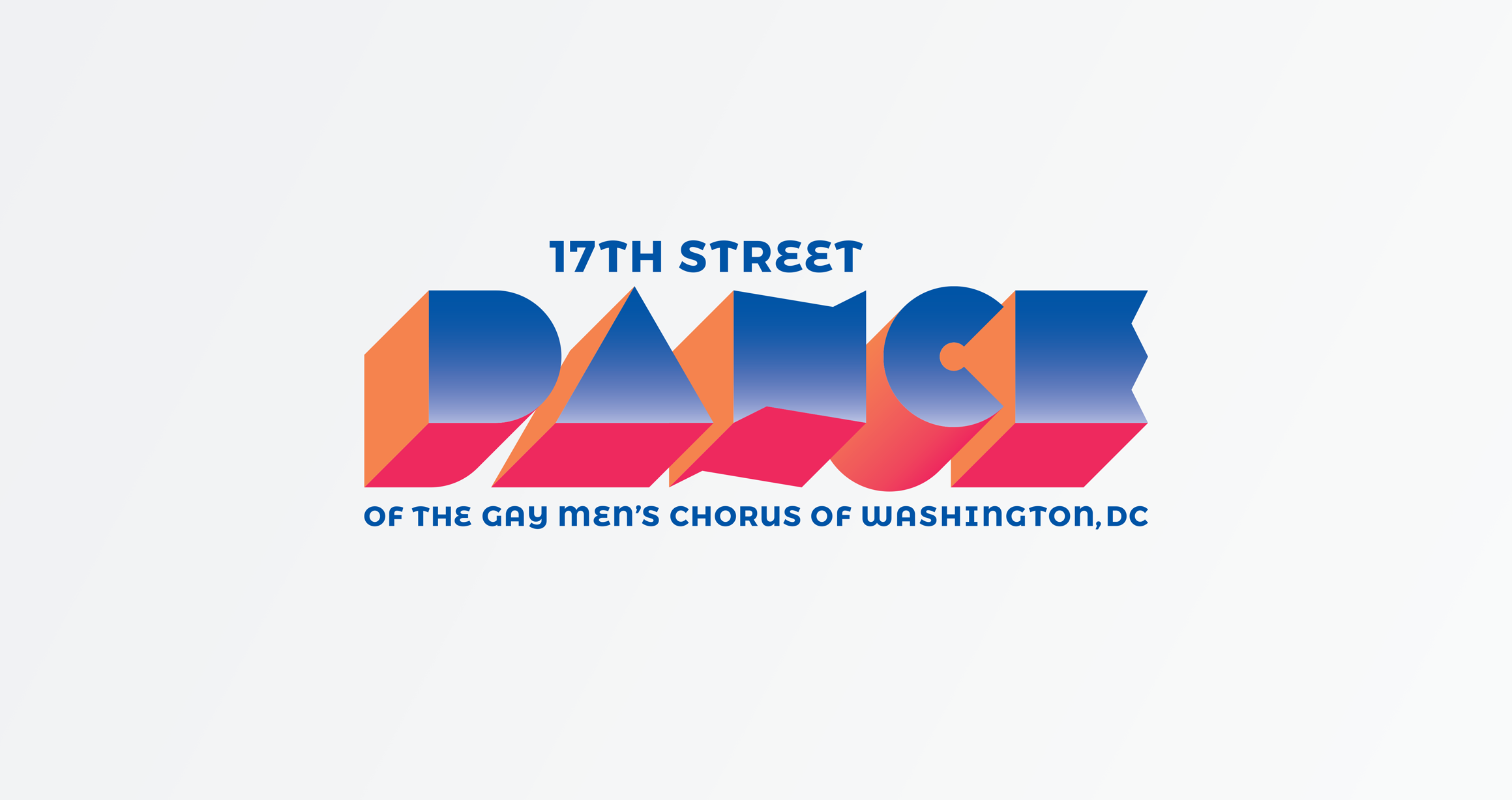
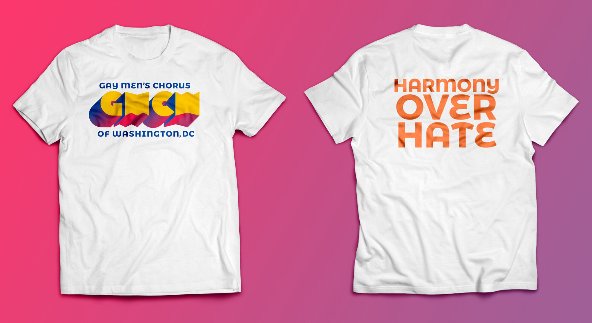
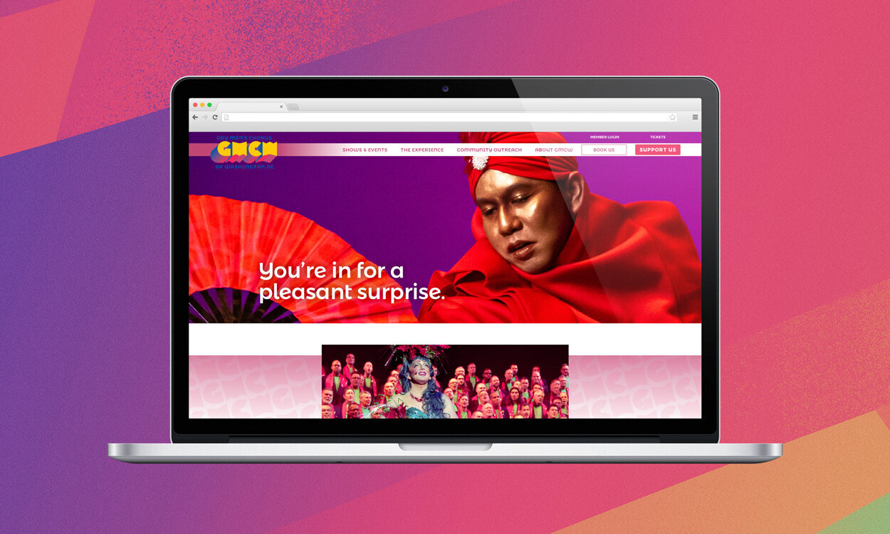
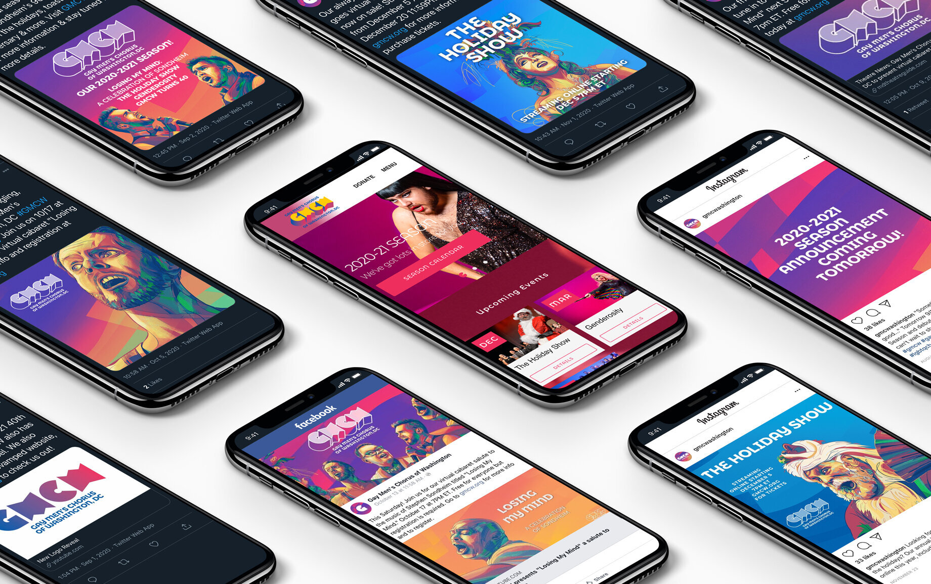
The Gay Men’s Chorus of Washington, DC| Rebrand & Marketing Campaign
The Gay Men’s Chorus of Washington (GMCW) needed a rebrand. Their old logo didn’t fit the attitude and professionalism of the actual chorus.
We dove deep into their history, interviewing members, past and present. We got a sense of who they were: vibrant, talented performers who were full of personality. We brought those qualities to life in a bold, modern family of logos, fonts, and photos. Bursting with color and quirk, each asset was a truer, newer representation of who the chorus was at heart.
After the rebrand, we moved to create an advertising campaign. The chorus was turning 40. This was a big deal; GMCW is one of the country’s best choruses—gay or straight. And surviving as a non-profit, in the face of adversity, for 40 years, was quite the accomplishment.
Only one problem. Turning 40, honestly, isn’t that unique. It’s just another number. And, more importantly, that number doesn’t affect a more important number: ticket sales.
So we focused on the product itself—the chorus. People didn’t understand how good they were. They’re a well-rehearsed, seriously-talented collective of singers, dancers, and storytellers. They’re comparable with a Broadway show. But you wouldn’t know it, unless you knew it.
We identified a library of photos; chorus members singing with raw emotion. But the photos themselves weren’t good enough. So we asked a well-known artist to transform these images into original illustrations. Then we paired those with poignant descriptors around how professional, skilled, and entertaining the chorus is.
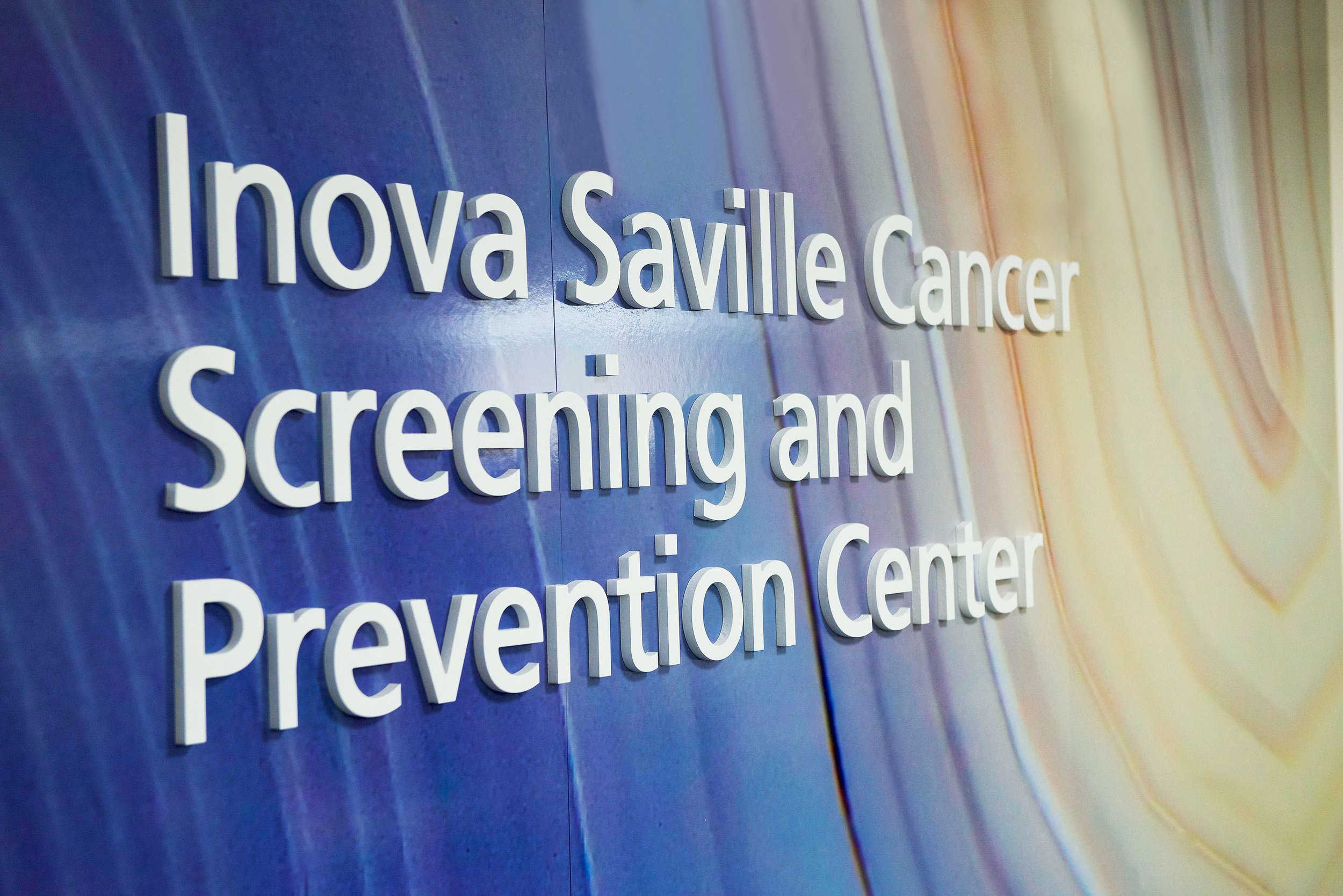
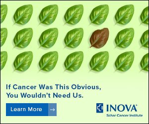
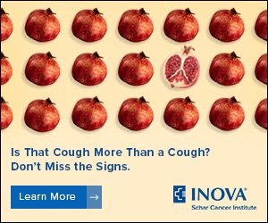
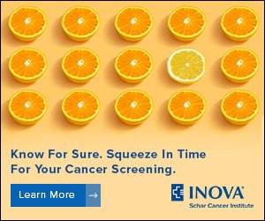
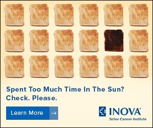
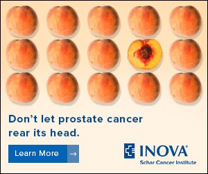
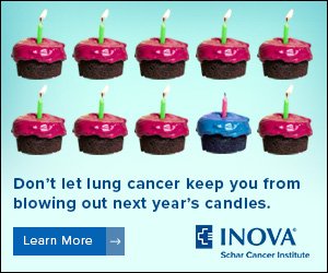
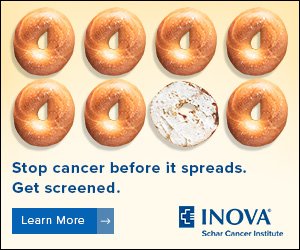
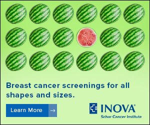
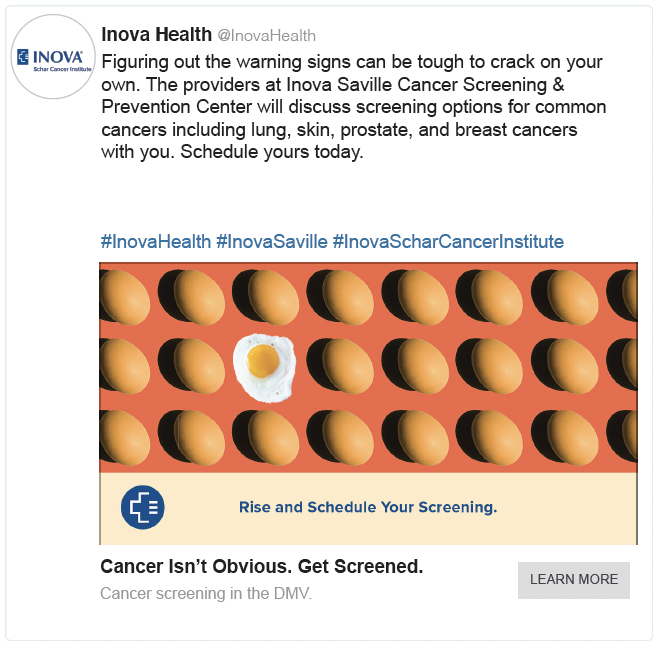
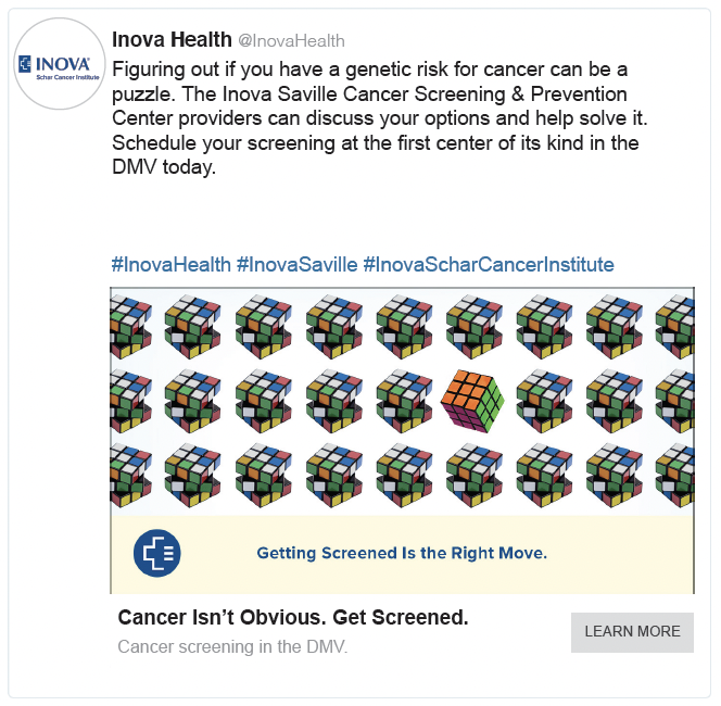
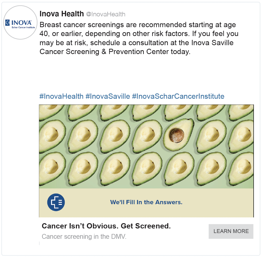
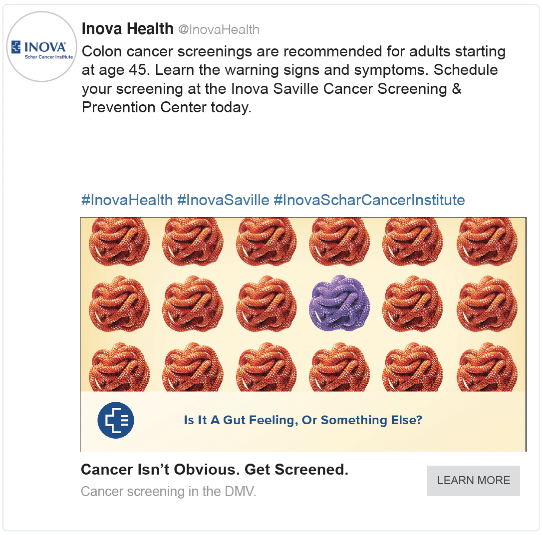
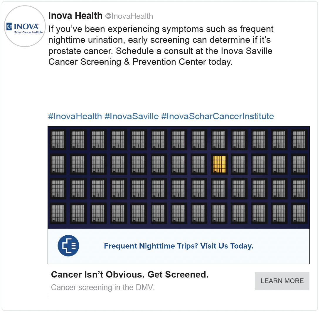
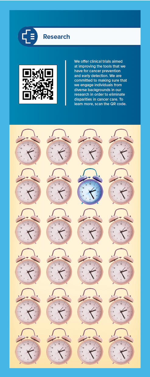
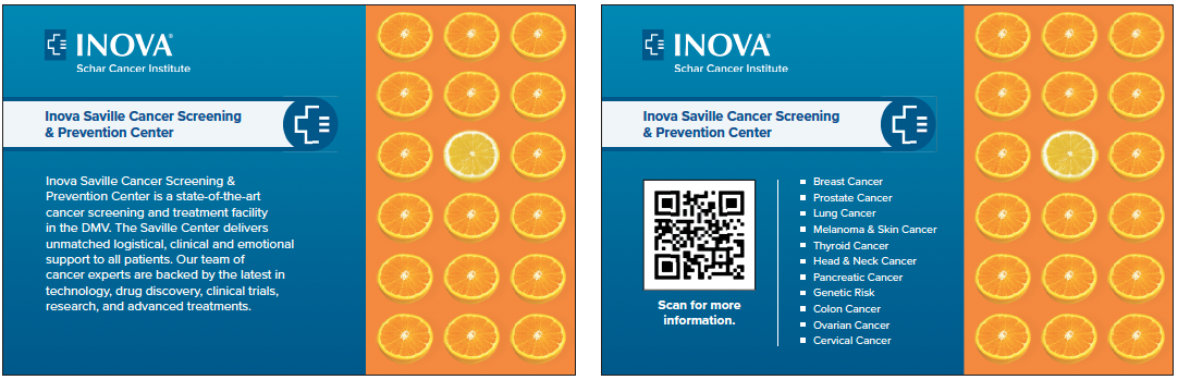
Inova SAVILLE CANCER SCREENING & PREVENTION CENTER | Marketing Campaign
This project tackled The Big C. The diagnosis so frightening, people fear uttering the full name.
The good news is, when it’s caught early, chances of survival are significantly improved. That’s why INOVA Health System built the first center of this kind in the DMV, with a generous donation from home builder Paul Saville.
Now the trick with cancer in the early stages is sufferers often confuse it for a milder cause. That’s because in the beginning, cancer isn’t obvious.
We built our fully integrated “Obvious” campaign in almost every medium imaginable—digital, social, radio, podcasts, video, blogs, marketing collateral, a microsite, and public relations efforts that included press, large and intimate events, and influencers.
To fully coordinate the effort, we worked with several departments from INOVA that included both marketers as well as physicians, and we led our cohort of vendors in advertising, PR, and production.
How did it do? Spectacularly. Metrics exceeded all benchmarks, and within two months of launching the campaign, they were fully booked six months out.


WILD BIRD FEEDING INSTITUTE | Social Campaign
There are more ways to beautify your backyard than can be achieved without a lawn mower and a pair of pruners.
One of the best is inviting nature to return to yards that have been cleared for humans.
The Wild Bird Feeding Institute understands this, and promotes it for its members, who are the business end of the wild bird feeding industry.
They asked us to develop a campaign that would drive interest in using bird feeders to beautify backyards. We targeted female suburban homeowners with high HHI and interests in nature and holistic lifestyles.
Our research found that interaction with birds is beneficial to our mental health. So we asked our audience to not only consider feeders as a way to beautify their backyards, but also as a way to relieve stress and achieve a sense of calm.
The digital, social media, and video campaign rolled out with compelling headlines and captivating imagery, all of which led to a site that asked users to input their zip codes to find their closest bird feeder retailer.
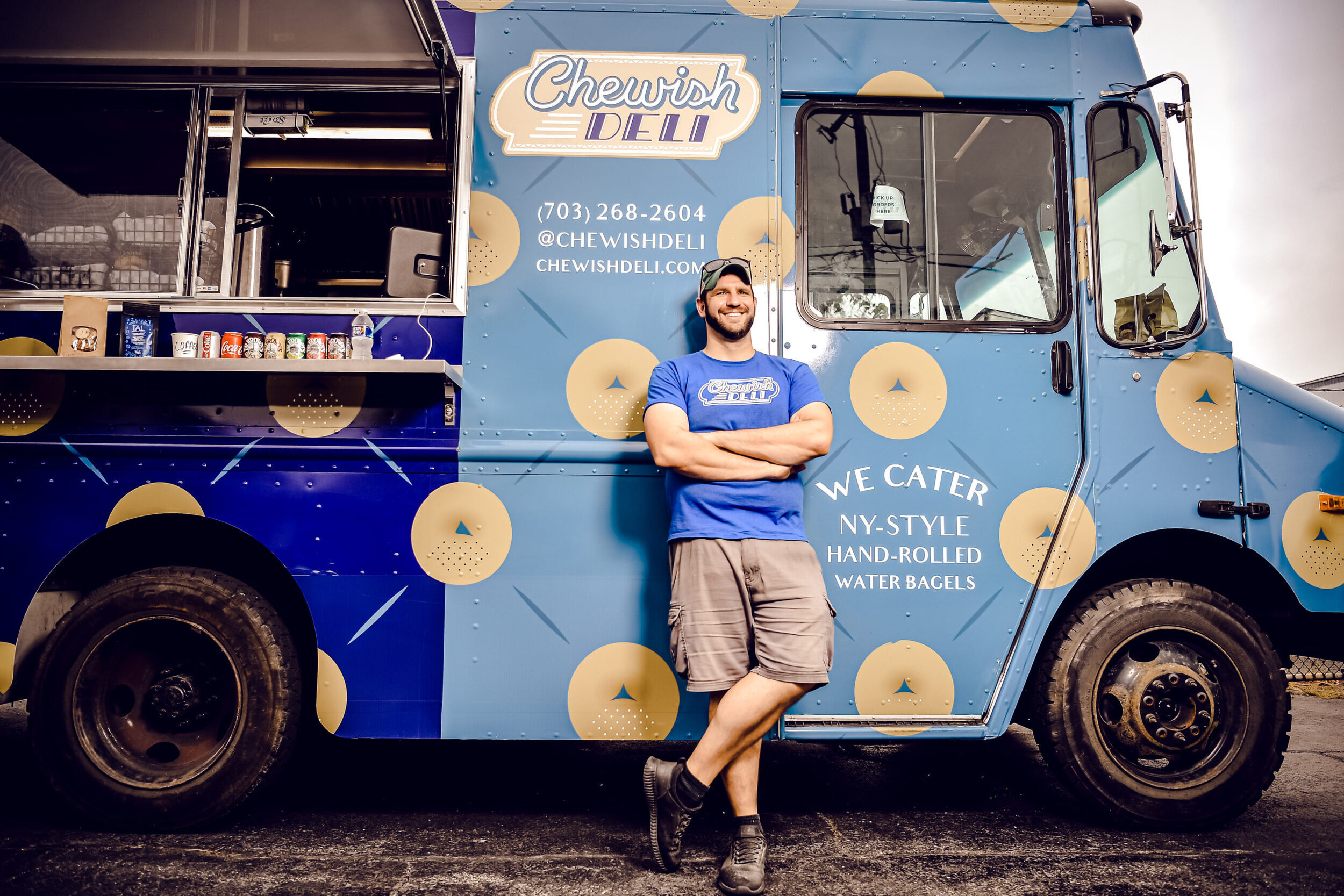
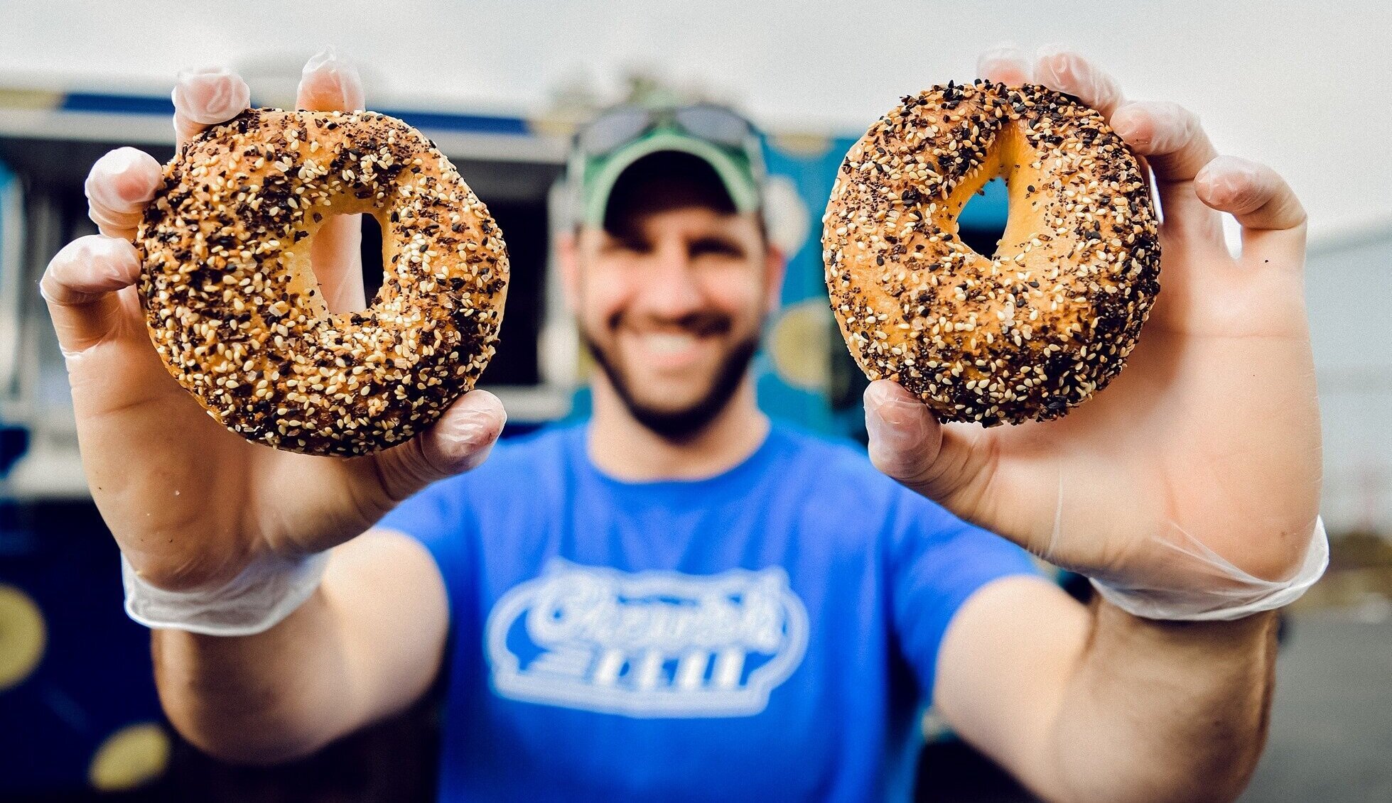
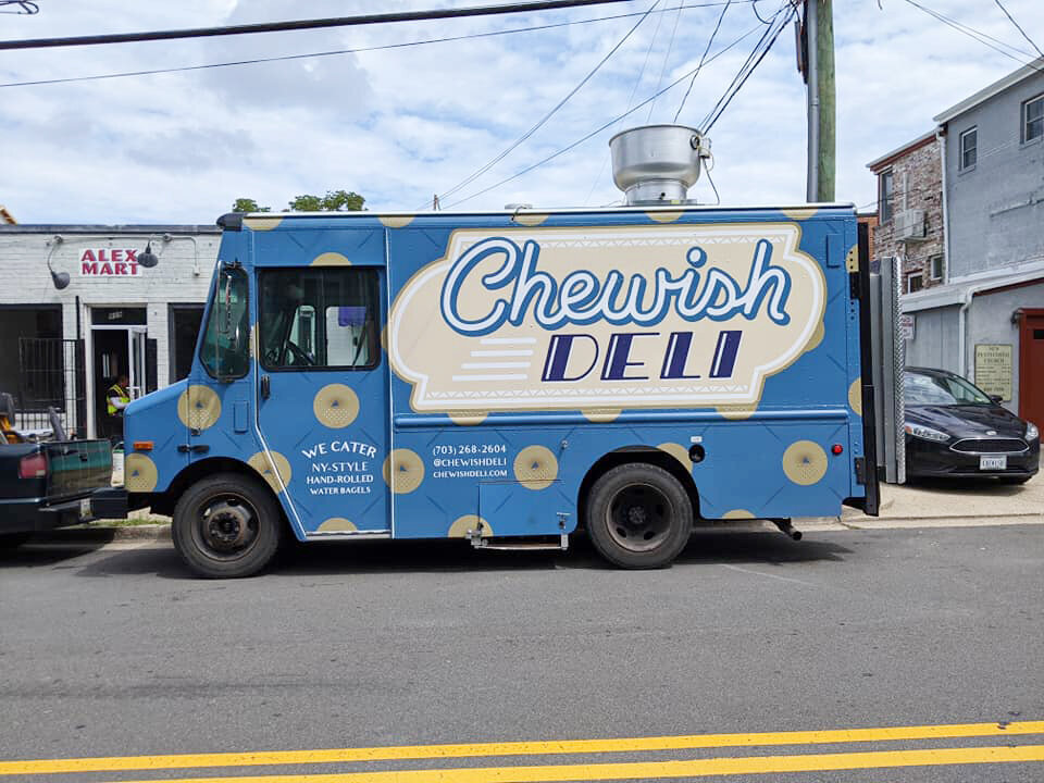
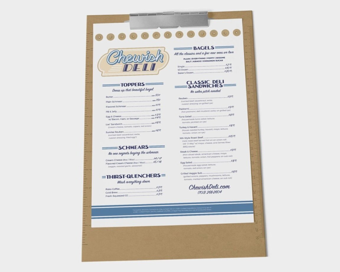

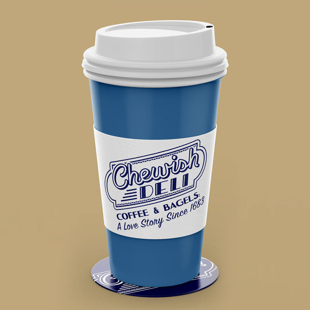
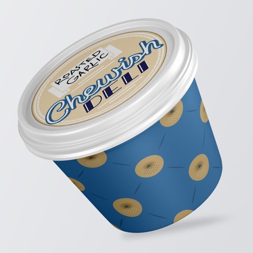
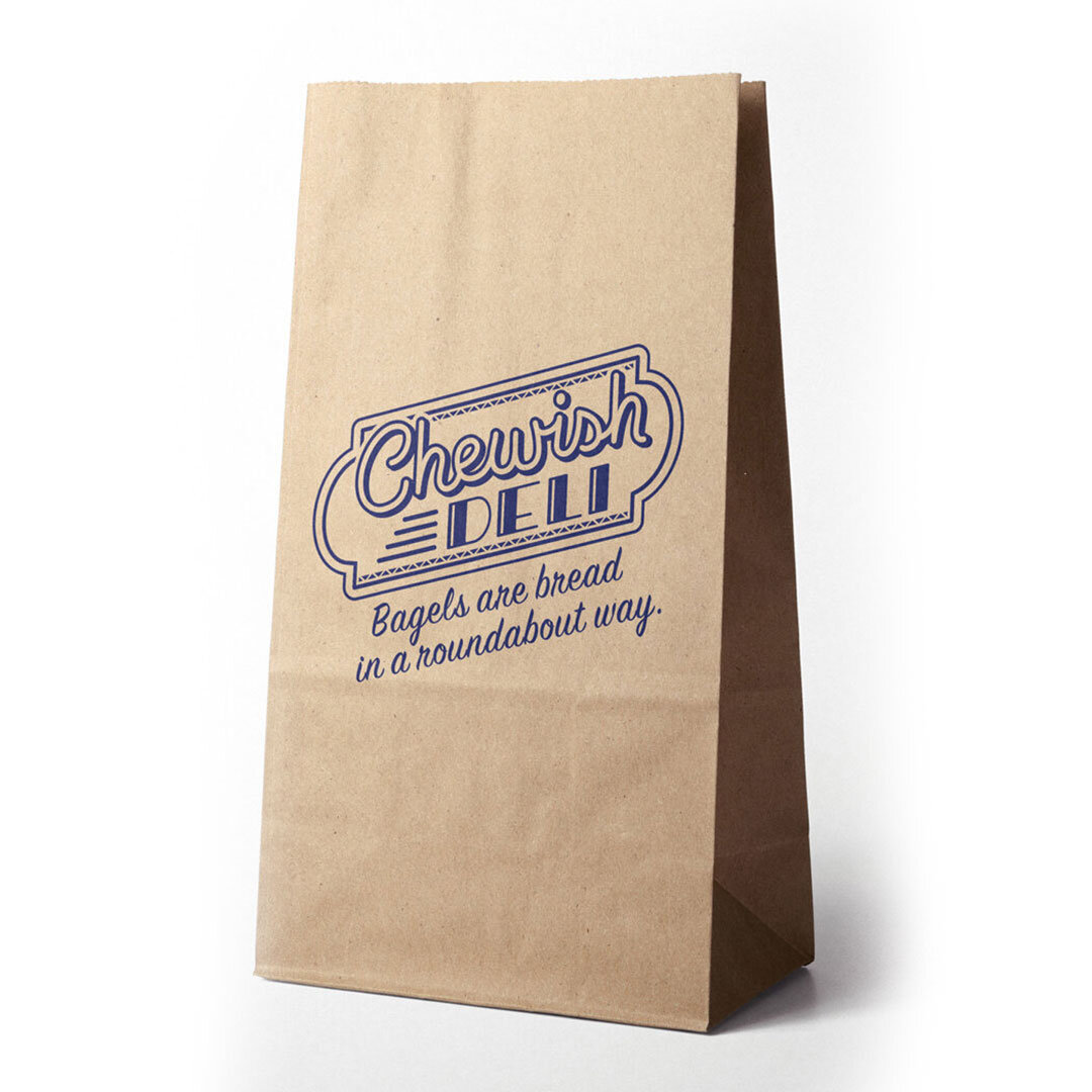
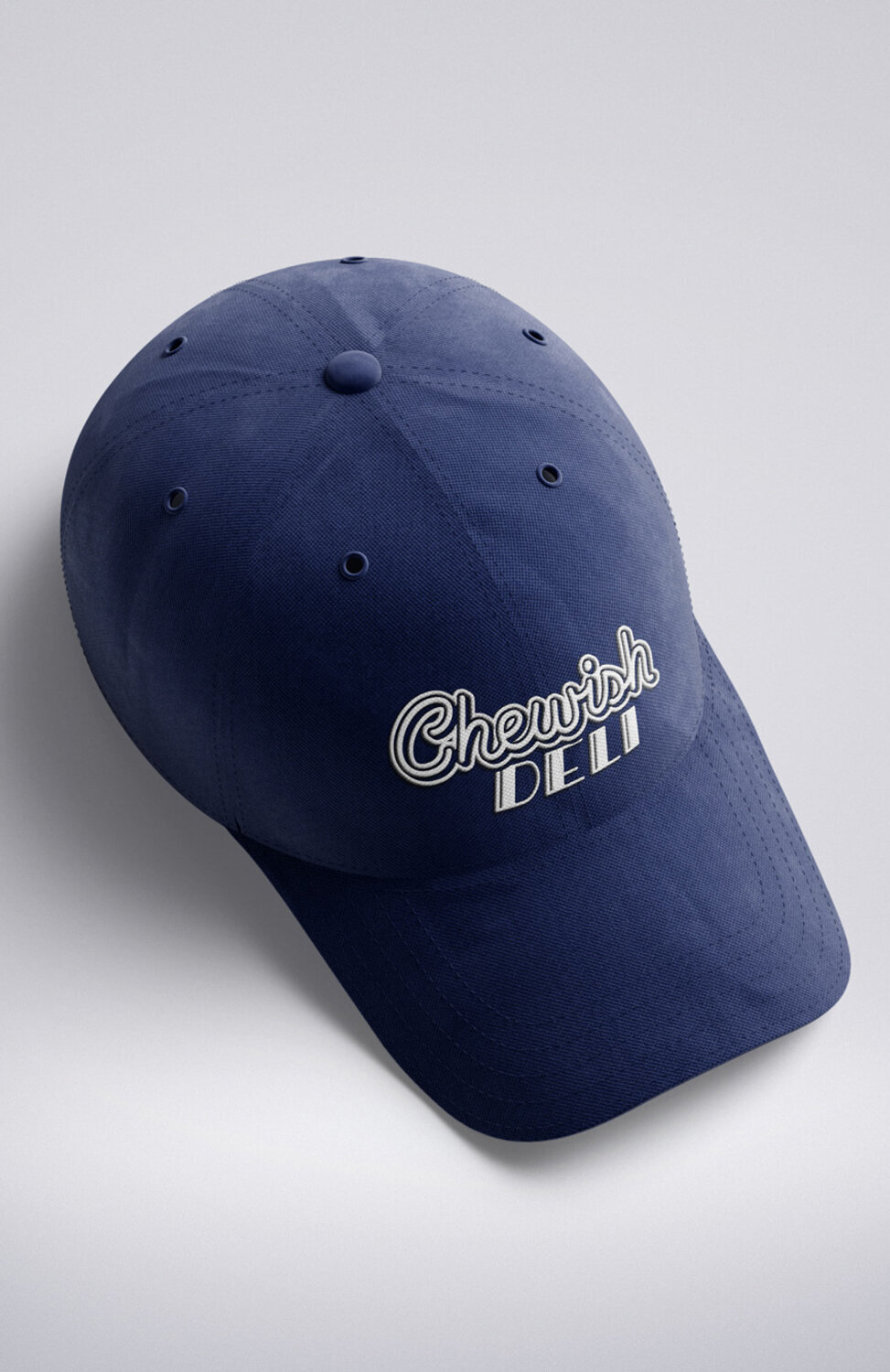
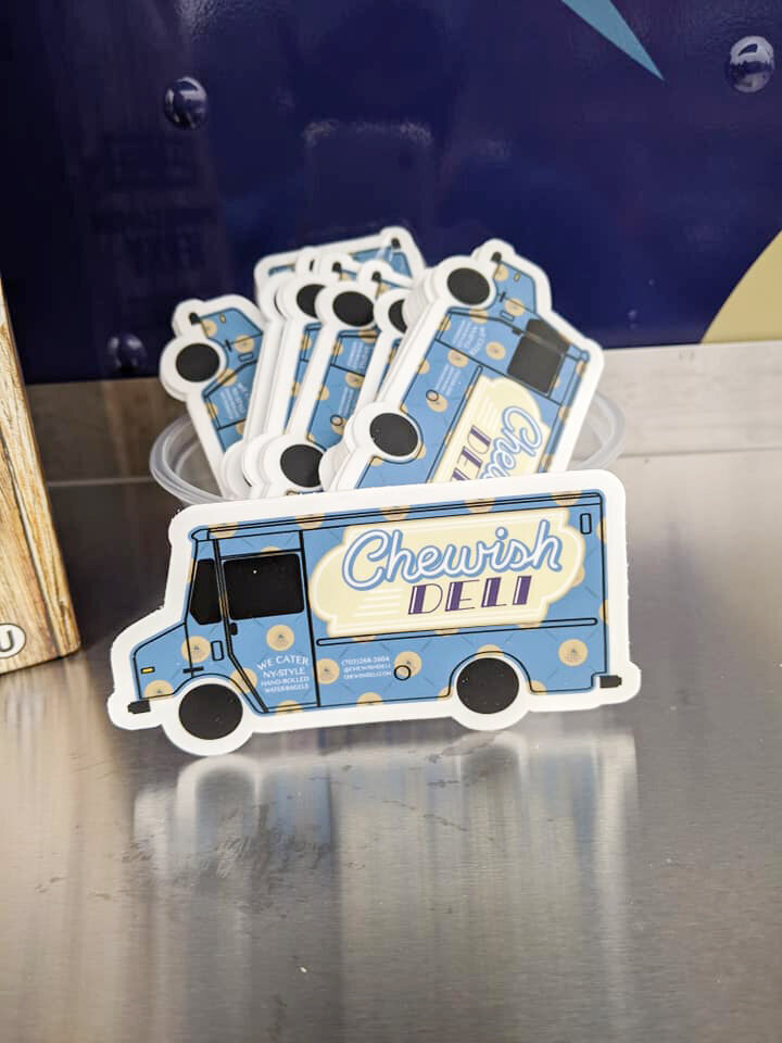
Chewish Deli | Branding
A business owner with a unique dilemma: his business and product were already out in the world. But he lacked a name, a look, and a brand.
He sold staple Jewish and Jewish-American foods. Made them from scratch, the old-fashioned way. And delivered to his customers’ doors.
Although bagels were his marquee product, he was more than a bagel shop. He sold sandwiches, such as reubens and pastrami on rye, as well as challah, rugelach, coffee, and juices. So we decided he would call his store a deli.
Longstanding deli names follow a recognizable formula—Katz’s Deli, Liebman’s Deli, Langer’s Deli.
New ones are more creative, such as Call Your Mother. And because our client is extroverted and gregarious, we leaned into the fun and called his business Chewish Deli.
The logo is built from mid-century fonts, from the time when delis first became known in this country outside of Jewish neighborhoods, with shades of blue and white that are theologically important in Judaism.
And while his signage features the main attraction—bagels—large and often, we made sure to include that his product is hand-rolled and made in the New York style. Those who know what that means, know it means quality.


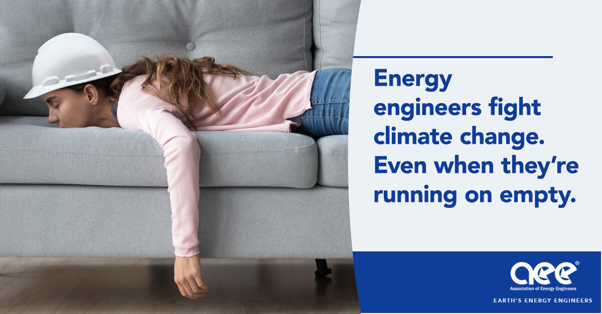
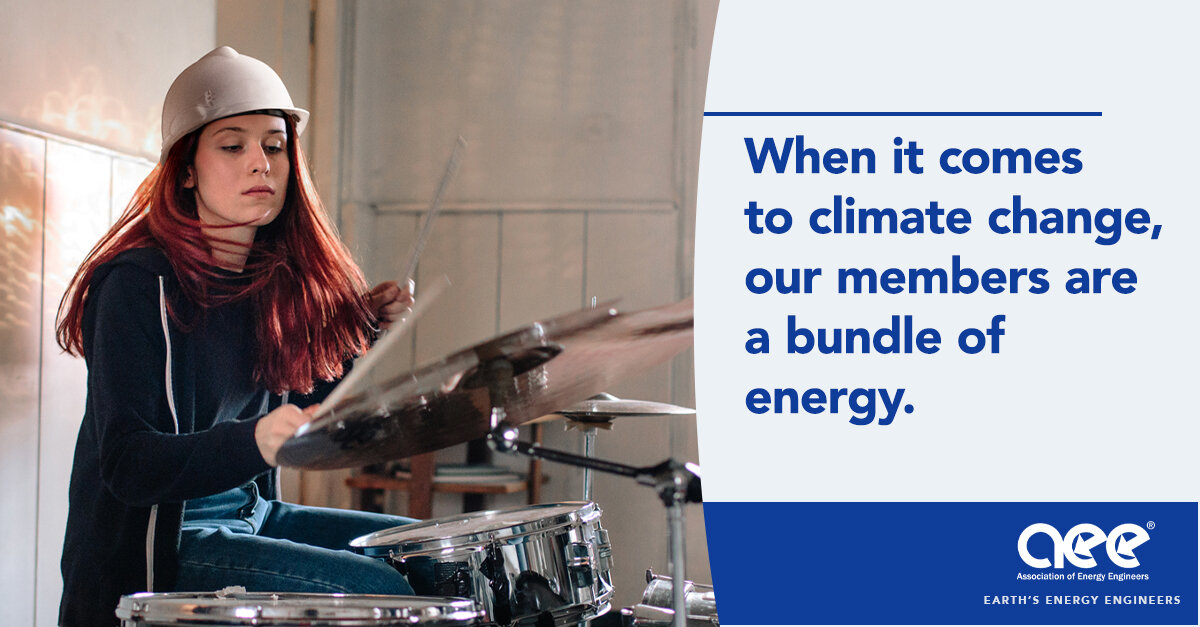

Association of Energy Engineers | Marketing Campaign
When you picture an environmentalist, what comes to mind? A protestor marching with a sign, someone wrapped around a tree, a science teacher?
Or do you think of an engineer?
From now on, consider an energy engineer when you think of those who are fighting to save our planet. Because by building and designing more energy efficient living and working spaces, they contribute directly to the health of our world.


International Packaged Ice Association | Marketing Campaign
There’s a secret lurking in packaged ice. You see, ice is food. Which means it’s susceptible to E. coli and other bacteria, just like food. Now, if store owners carry ice that’s certified by the International Packaged Ice Association, they have no need to worry about infecting their customers or themselves, or suffering the consequences of litigation.
But if they bag their own ice, they should worry. Therefore, we created this campaign for IPIA, targeting store owners through digital and print media. We let them in on the secret, and told them what to do about it. If the campaign looks shocking, that’s on purpose. The dangers are frightening. Luckily, the solution is simple.


Neighborhood Health | Marketing campaign
Neighborhood Health is a non-profit community health center. They decided to launch a campaign focused on HIV testing among high-risk populations where the disease itself is still stigmatized.
The audience included LGBTQ+, Latinx, and immigrants from Central America and East Africa. That’s a challenge, since English isn’t everyone’s first language. We needed a message that was simple enough to translate to Spanish, Portuguese, and Amharic. But still interesting enough to get people’s attention and convince them to act. The powerful, two-word phrase we landed on was: Be selfish.
Our thinking was this: We’re smack dab in the era of “me.” Between social media and other forms of self-empowerment, it seems we’re all “living our best life.” We wanted to insert personal health into that conversation. When it comes to knowing your HIV status, “being selfish” is, well, quite healthy.
From there, art and copy got moving, marrying that simple phrase to striking portraits of our audience. We zoomed in the camera to make things more personal; to get people to empathize on a deeper level.
We created print elements, collateral, roll-up posters, and social media. We even created dating app profiles to meet the target where they are. Each piece drove to a website, where people could apply for HIV services.
After months out in the world, the number of engagements was on the rise. And HIV cases, locally, were on the decline. The client loved the work so much, they sent us photos of the roll-up posters in their office as soon as they came off the press.
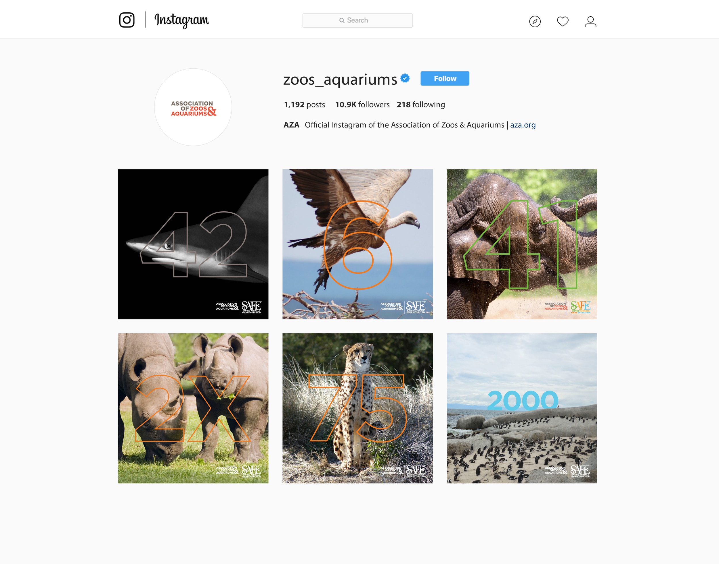
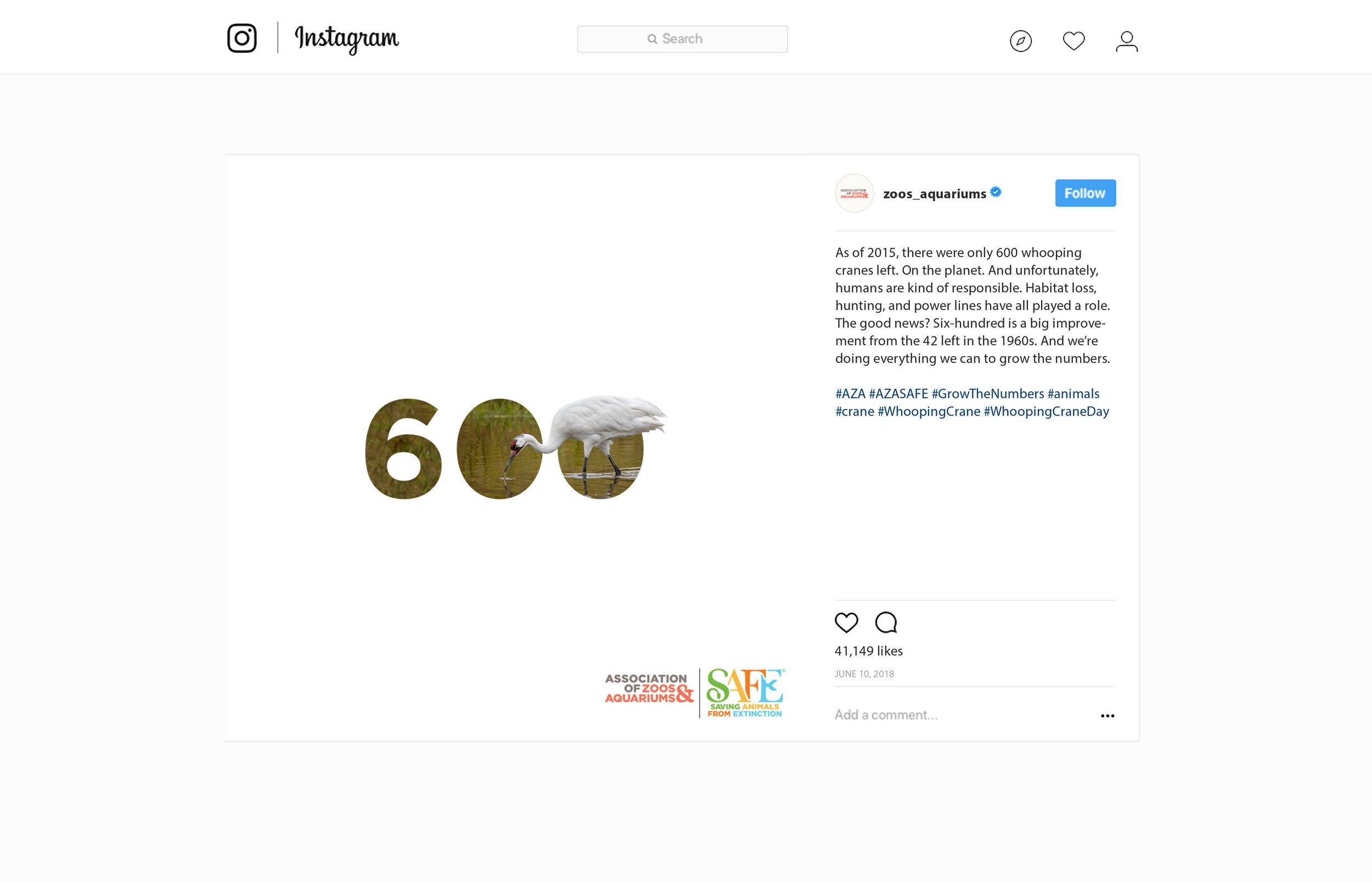
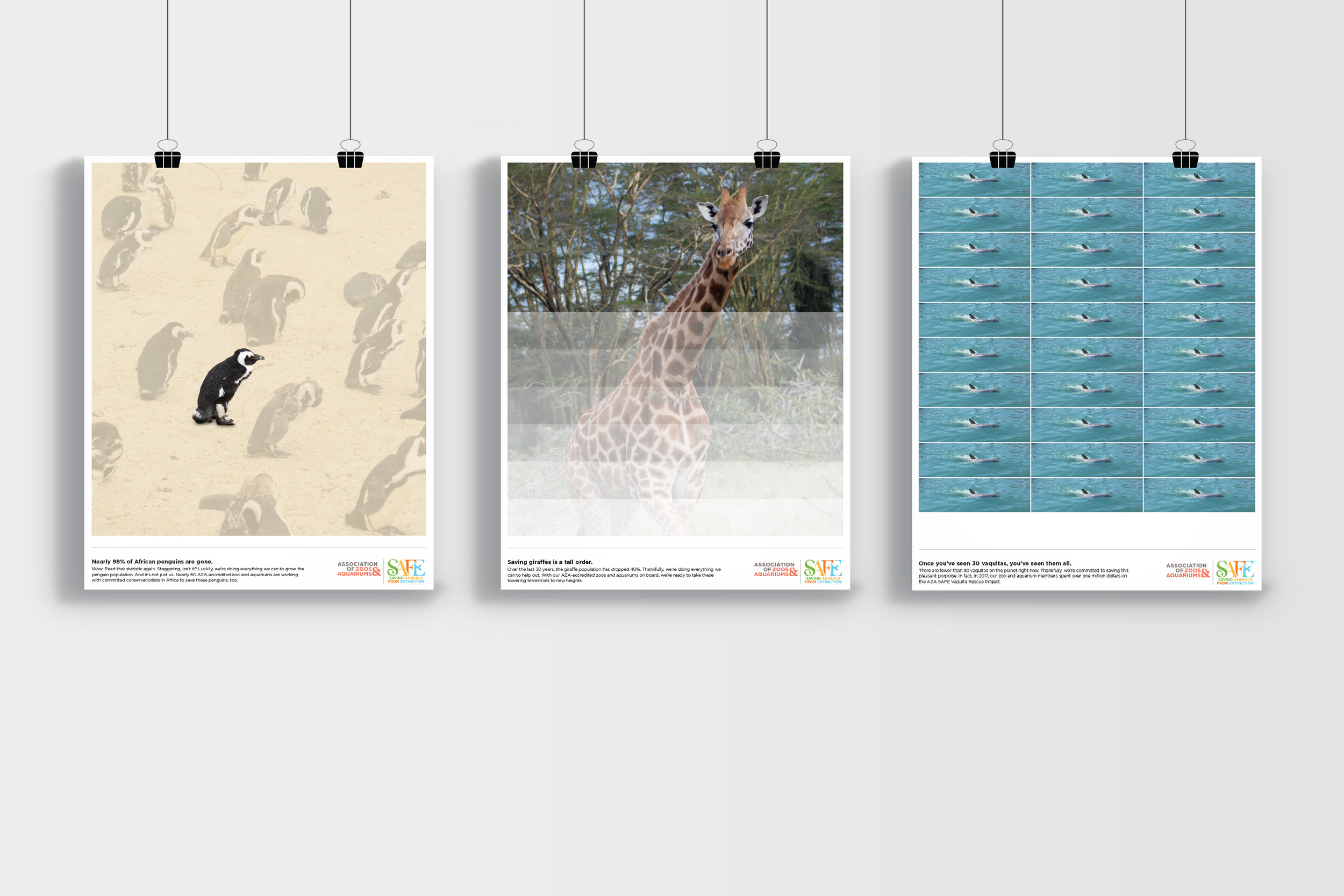
Association of Zoos and Aquariums | Social
It's always nice to use our creative powers for good. And saving endangered animals is as good as it gets. So when the Association of Zoos & Aquariums asked for help, we jumped at the opportunity. Over a short period, we knocked out two months worth of content for Instagram, Twitter, and Facebook. We also designed and produced 30 posters for their zoo and aquarium partners.
Our thinking? Well, to many people, "endangered" is a vague, tired term. But numbers quantify the impact and get people to care. Our #GrowTheNumbers campaign paired animals and statistics to help people understand the gravity of the situation. In addition, the campaign also celebrated the bright side; the things AZA did to help out.
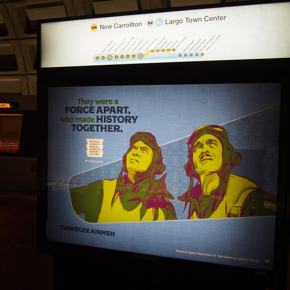
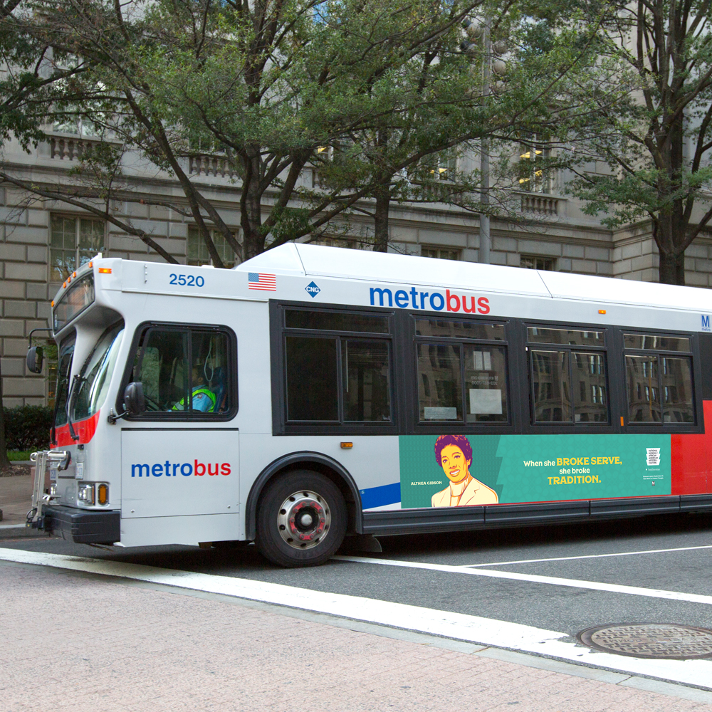
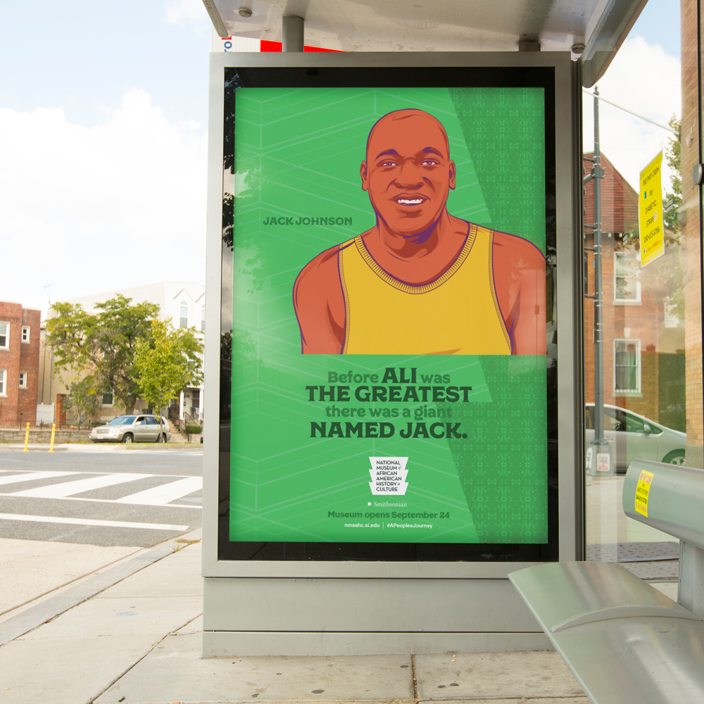
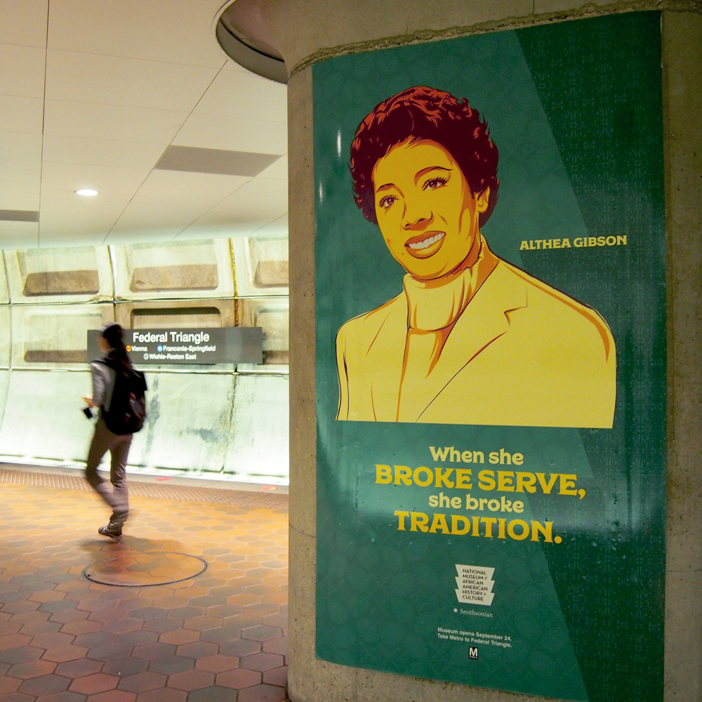
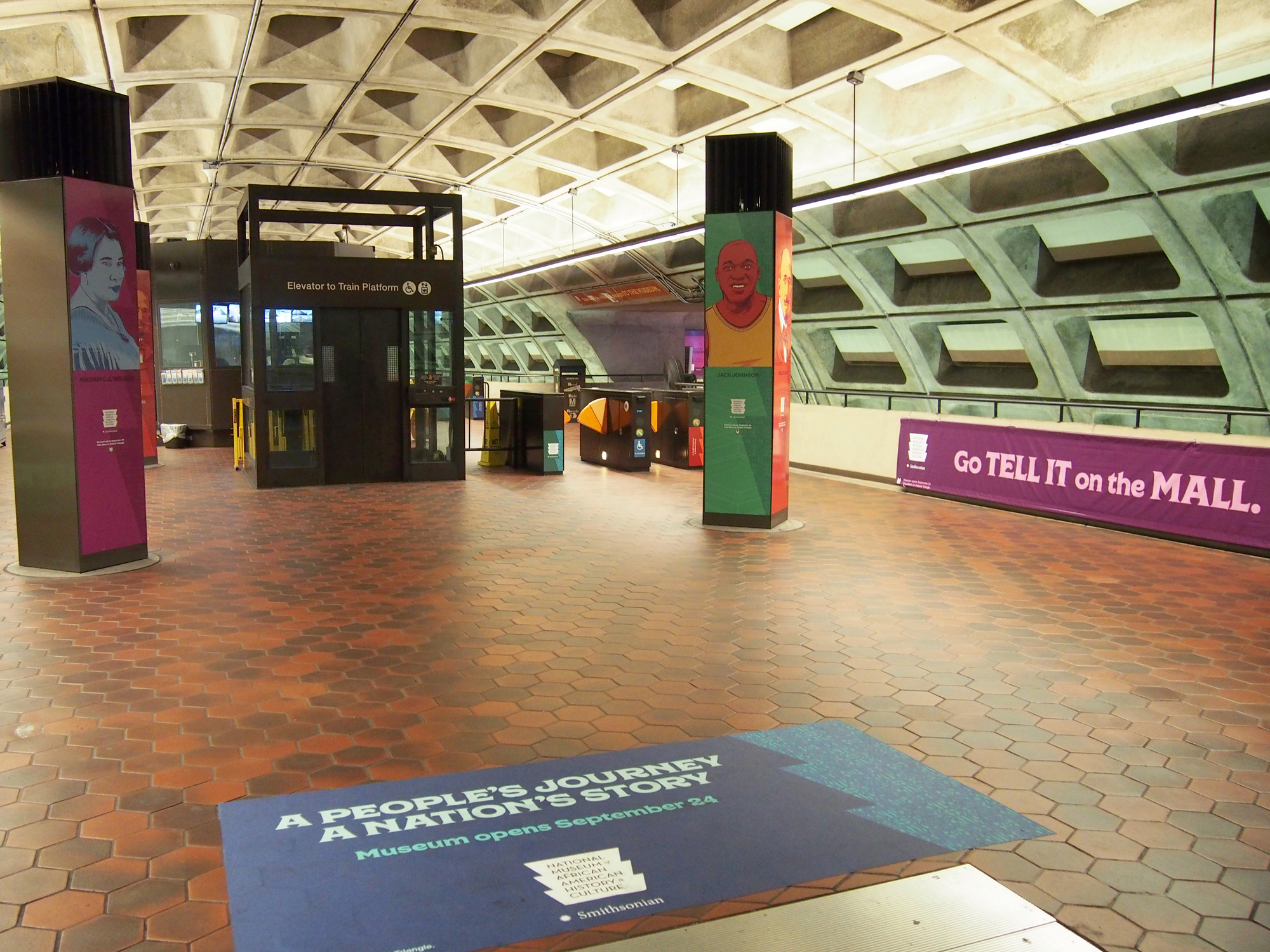
National museum of african american history and culture | ooh
The National Museum of African American History and Culture was opening. Finally. And it was a big deal. This beautiful landmark at the Mall in DC is a testament to one people’s triumphant, odds-defying story. And we had to channel that spirit in our ads.
We worked with 82 Degrees and created a gorgeous, OOH campaign that dominated Metro stations and bus shelters in the DMV. Each ad featured a key figure from the story, paired with a line heralding their achievement. And the art direction provided the perfect backdrop; classic illustrations that paid tribute to the wall murals from the subjects’ hometowns.
Shout out to Jamin Hoyle for the art direction. And Robert Greenette for illustration.
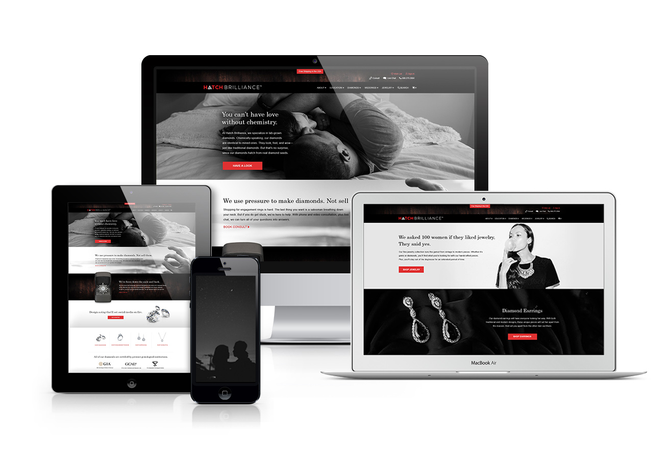
Hatch Brilliance | Website
Hatch Brilliance is a new marketplace for lab-grown diamonds. They came to us for branding and website design. And that’s exactly what we gave 'em.
To start, we dove deep on the competition. Turns out, 90% of jewelry websites were the same: stark white backgrounds with generic, retail-centric copy. Boring.
Next, we dug into the target. These were smart, scientific, thirty-something males with an affinity for high-end brands like Apple, Tesla, and Suntory—a Japanese whiskey-maker. These brands had plenty in common: reds, whites, and blacks. Plus clean backgrounds and lots of wood grain.
We meticulously melted everything together to form a bold, unmistakable look. And finished it off with a confident and friendly voice that matched the personalities of the owners.


MURLARKEY | Video
MurLarkey is a distillery in Bristow, VA. Yup. They make booze. And while the free drinks are nice, helping a local business multiply is even better.
MurLarkey’s product line was strong. Spirits were even winning awards on an international level. (Seriously. Their Divine Clarity vodka is a two-time gold medalist.) But while the judges loved them, many consumers didn’t know about ‘em.
To help spread the word, we created a short video series for social media. The videos were gorgeously shot, showcasing the distillery’s inviting interior. More importantly, we focused on the founders. This was their story, and it overlapped perfectly with the history of distilling in Virginia.
Since the videos posted, business has surged. Social media engagement was 4x greater than any previous post. And there’s not a bad comment in the bunch. Given our outrage era, it’s nice to know good clients and good work can still make a positive impact.
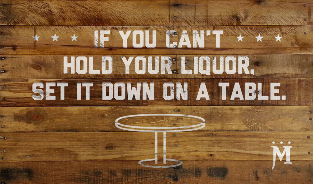
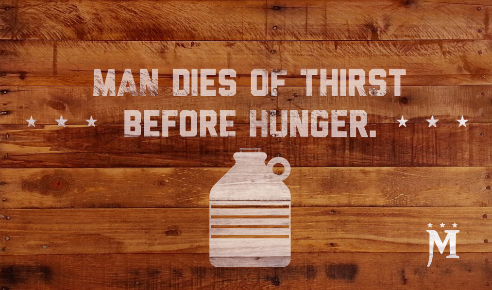
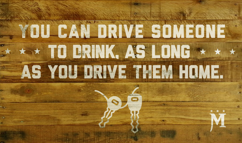
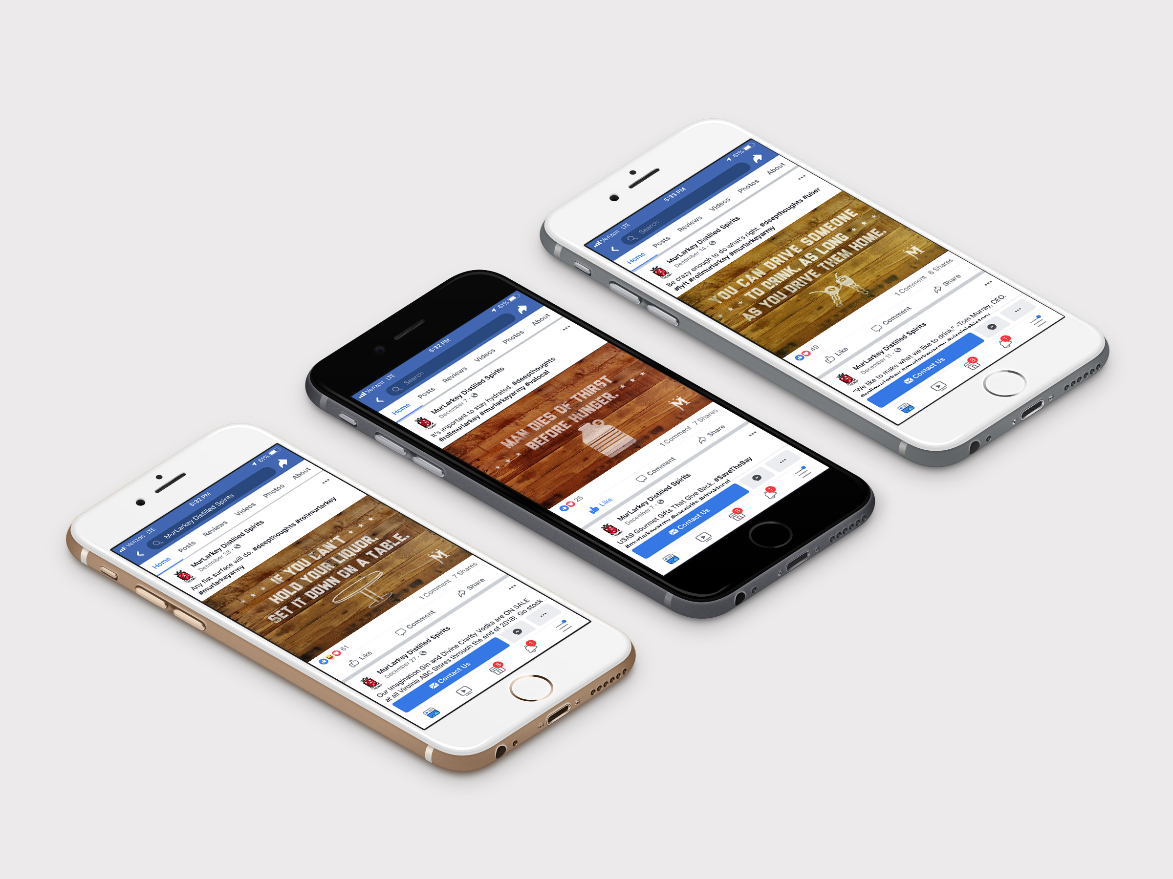
MURLARKEY | SOCIAL
Like the MurLarkey brand, the founders are tons of fun. After a few seconds of conversation, their collective sense of humor is evident. And we wanted to instill that humor into their social media presence.
When you visit in person, the distillery walls are filled with silly, drinking-related quotes. We thought, hey, this is ripe for social media. So we made a dozen fresh ones, and served ‘em up on Facebook and Instagram.
From an engagement standpoint, the posts hit more likes, loves, and shares then anything previously. And the client loved them so much, they asked us to repurpose the now-famous wooden boards as postcards.